

Viv Harries is the Founder of Vivi Creative. He works with businesses to give them the creative edge with unique designs and a solid brand identity.
recent posts
- What's the Difference Between a Logo and a Brand Identity?
- How Much Does Brand Design Cost in the UK?
- What Is Branding? A Guide for Business Owners in 2026
- Thinking About Rebranding Your Business in Wales? Here’s What You Need to Know
- How to Build a Brand That Connects Emotionally with Your Audience
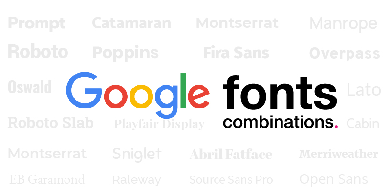
20 FREE Google Fonts Combinations
Choosing typefaces for your design project can be a time consuming task, and that's even before you pair them with another font. You want to choose a combination that compliments your design and there are so many options, with subtle differences between them. A font can make or break a design and it is as important to get the typography correct as it is to create the design in the first place. There are thousands of fonts to choose from and you need to choose one that works with your design and conveys the correct message for the brand.
Google fonts launched 10 years ago and has been an amazing tool as it gives designers access to so many royalty free, web based fonts. You can spend hours on there, scrolling though an amazing library of typefaces and downloading them to your computer.
When designing a brand for start up business one of the main tasks is deciding on the typefaces that the company is going to use across its branding. It is important to choose fonts that work well as a combination and complement each other.
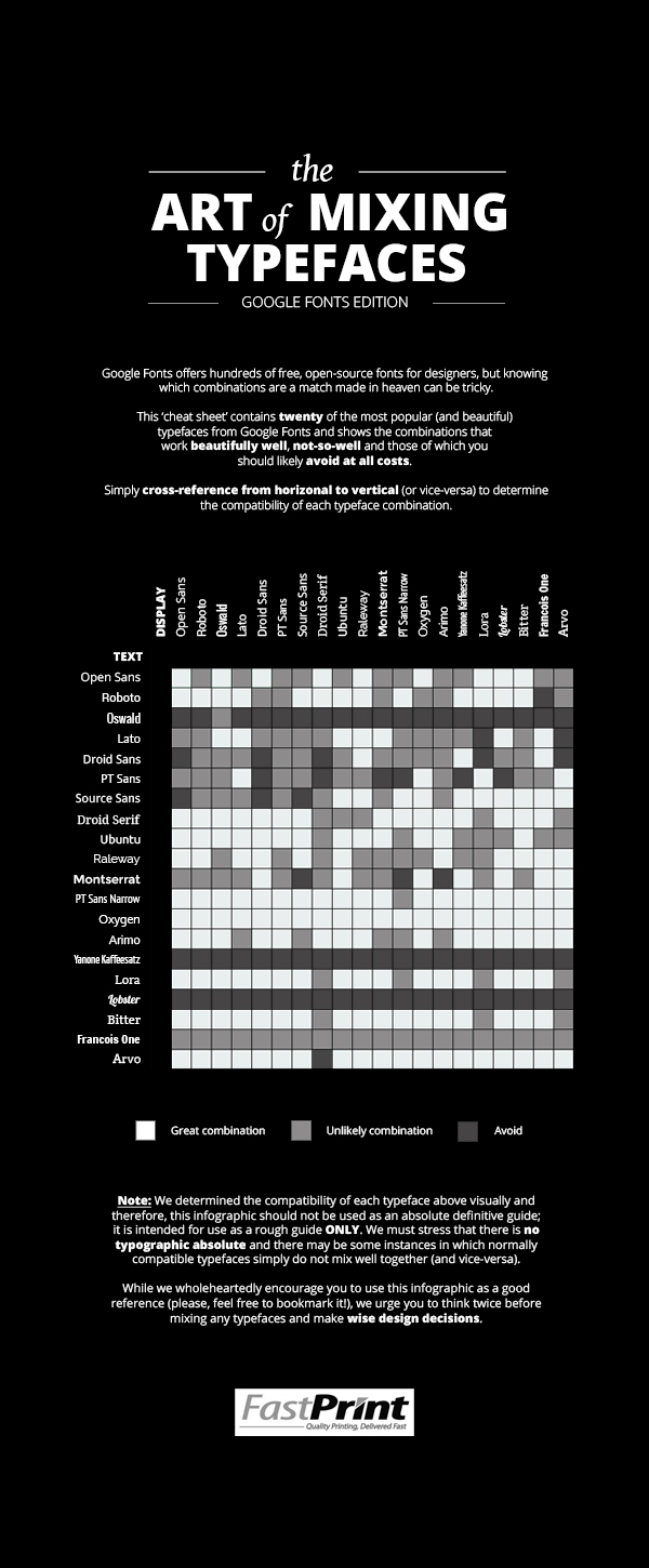
Below is a google fonts cheat sheet showing which font combinations work, and which you should avoid.
For this blog post I thought I would search the web and show you a few of my own favourite combinations for inspiration. So here you have the Vivi Creative list of FREE font combinations currently available on Google fonts.
When pairing font combinations it often pays to keep it simple, like pairing serif and sans serif fonts for example.
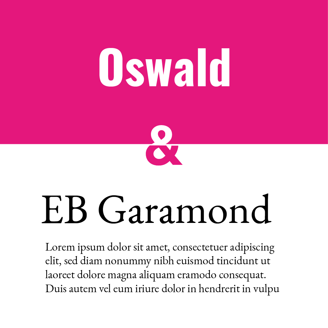
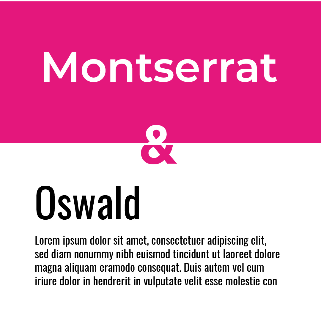
Oswald is a reworking of the classic style historically represented by the 'Alternate Gothic' sans serif typefaces. The characters of Oswald were initially re-drawn and reformed to better fit the pixel grid of standard digital screens. Oswald is designed to be used freely across the internet by web browsers on desktop computers, laptops and mobile devices.
EB Garamond is intended to be an excellent, classical, Garamond. It is a community project to create a revival of Claude Garamont’s famous humanist typefaces from the mid-16th century. The digital version closely reproduces the original design by Claude Garamont.
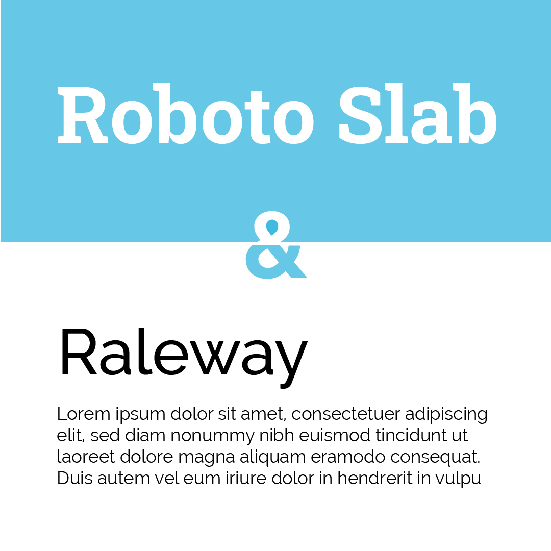
Roboto Slab has a dual nature. It has a mechanical skeleton and the forms are largely geometric. At the same time, the font features friendly and open curves. It can be used alongside the normal Roboto family and the Roboto Condensed family.
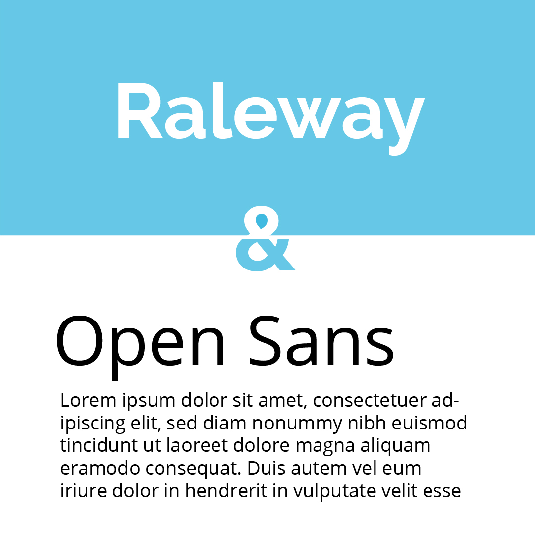
Raleway is one of my favourite fonts. It is an elegant sans-serif typeface family intended for headings and other large size usage. It was expanded into a 9 weight family in 2012.
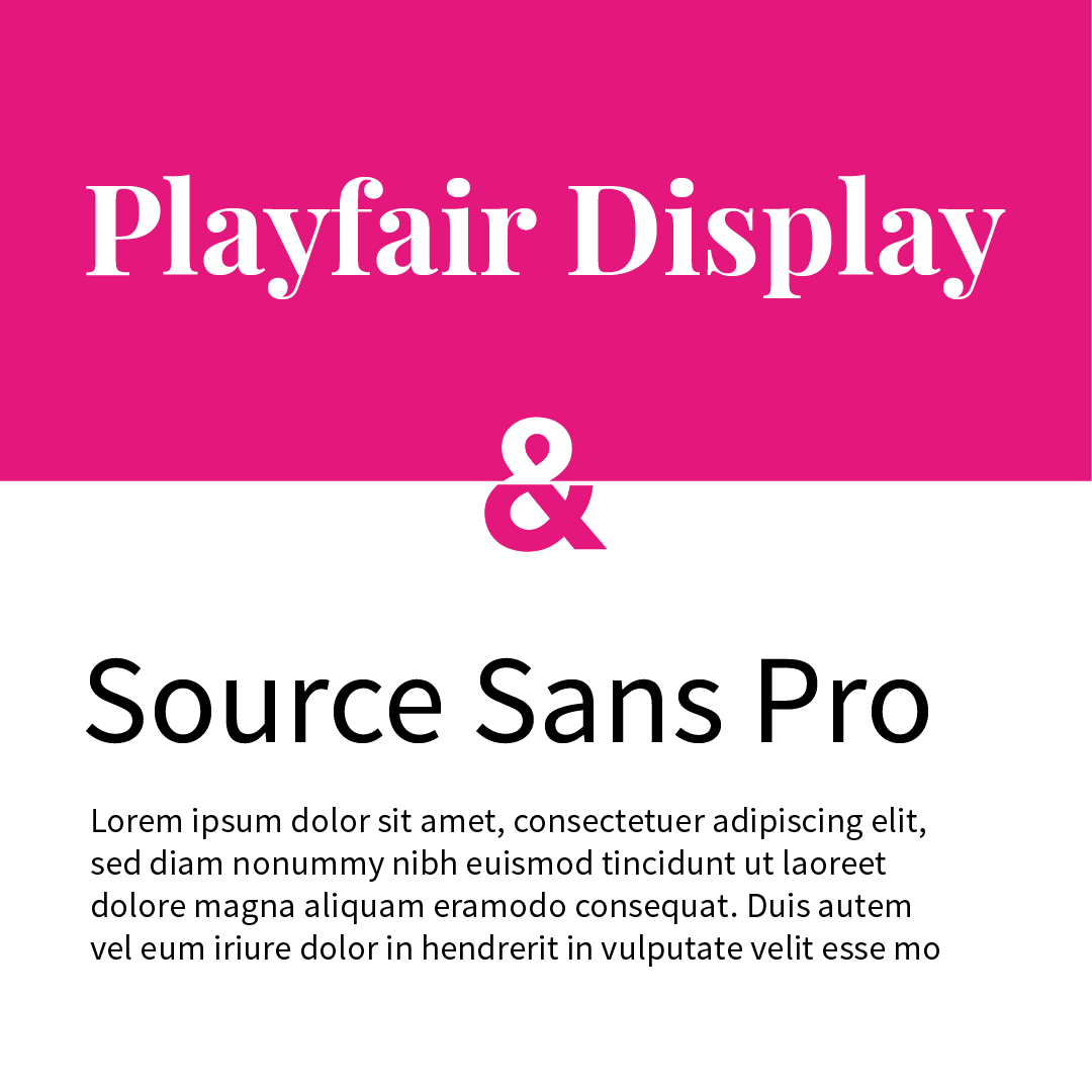
Playfair display is a transitional design in the style of late 18th century European Enlightenment when broad nib quills were replaced by pointed steel pens as the popular writing tool of the day. It takes influence from the designs of John Baskerville.
Source Sans Pro, Adobe's first open source typeface family, was designed by Paul D. Hunt.
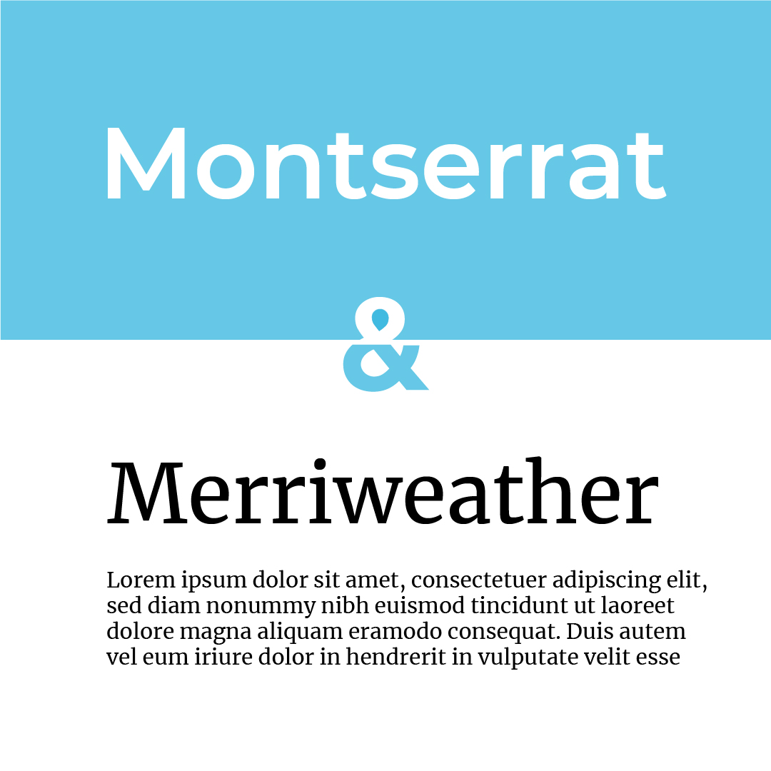
Montserrat was designed by Julieta Ulanovsky who was inspired by the old posters and signs in the traditional Montserrat neighbourhood of Buenos Aires.
Merriweather was designed to be a text face that is pleasant to read on screens. It features a very large x height, slightly condensed letterforms, a mild diagonal stress, sturdy serifs and open forms.
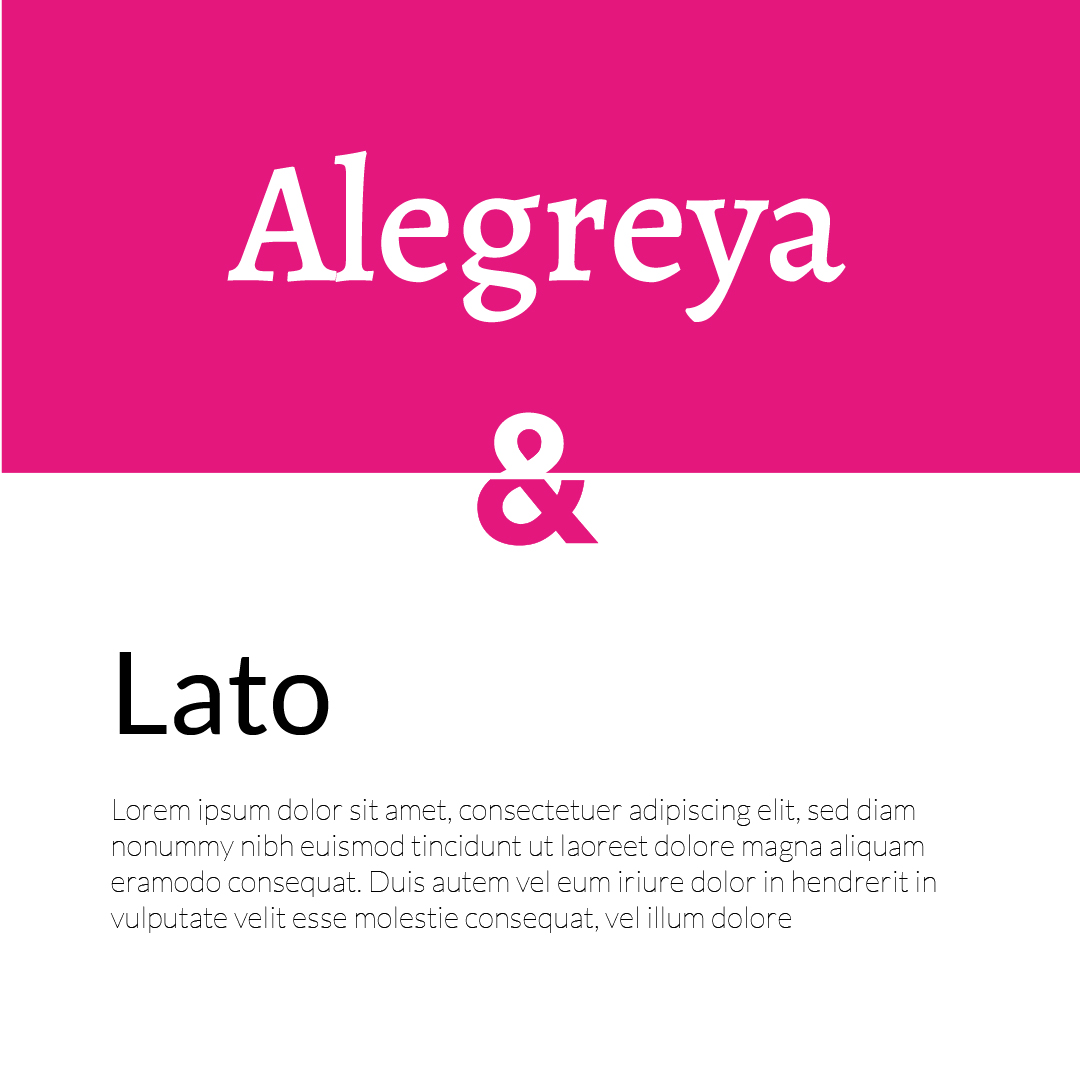
Alegraya was chosen as one of 53 "Fonts of the Decade" at the ATypI Letter2 competition in September 2011, and one of the top 14 text type systems.
Lato is a sans serif typeface family started in the summer of 2010 by Warsaw-based designer Łukasz Dziedzic (“Lato” means “Summer” in Polish).
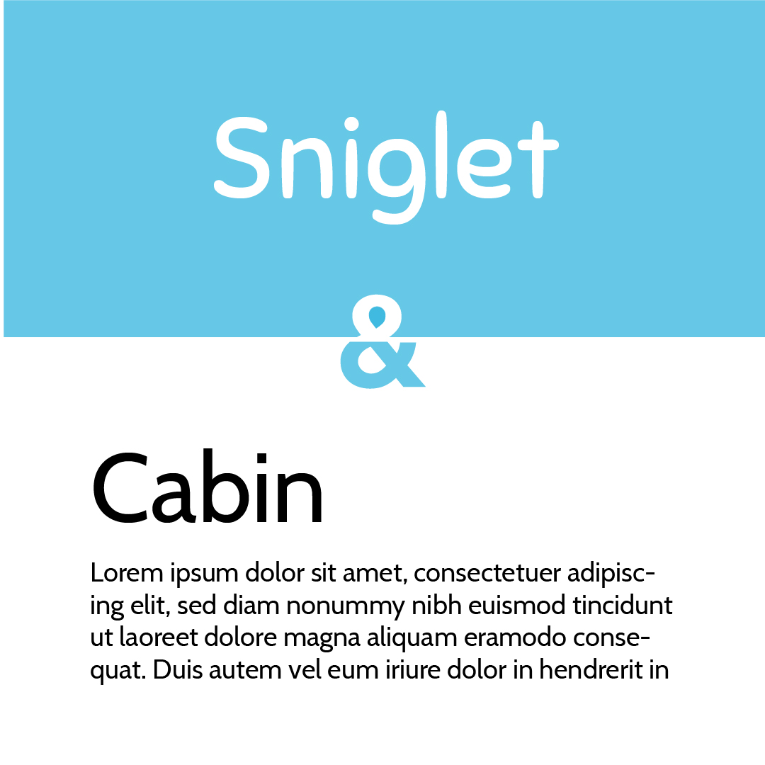
Sniglet is a rounded display face that’s great for headlines and has a playful style.
The Cabin font family is a humanist sans with 4 weights and true italics, inspired by Edward Johnston's and Eric Gill's typefaces, with a touch of modernism.
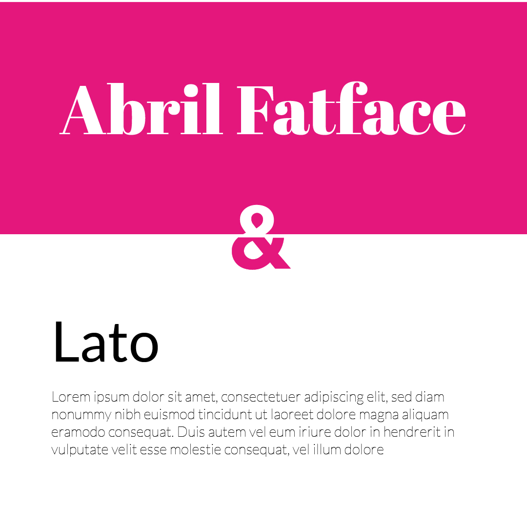
Abril Fatface is inspired by the heavy titling fonts used in advertising posters in 19th century Britain and France. The thin serifs and clean curves lend the typeface a refined touch that give any headline an elegant appearance
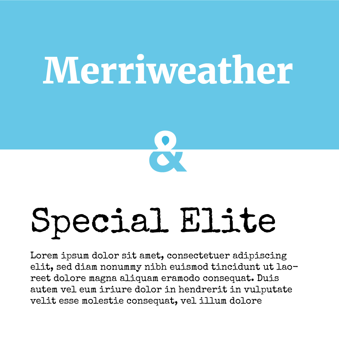
Special elite mimics the typewriter style font and adds a little bit of inked up grunge and a little old school analog flavour work together to give you a vintage typewriter typeface for your website and designs.
Typography is key to giving a brand a strong identity, so it pays to take your time when choosing them. A font speaks to customers about who you are and what you stand for. Are you playful and lighthearted, strong and traditional, or sleek and sexy? By using complimentary fonts you can tell the world who you are from a glance.
Try some of these font pairings on your designs and let me know what your clients think of them.
Thanks for reading.
related posts


about the author

about the author
Viv Harries is the Founder of Vivi Creative. He works with businesses to give them the creative edge with unique designs and a solid brand identity.