

Viv Harries is the Founder of Vivi Creative. He works with businesses to give them the creative edge with unique designs and a solid brand identity.
recent posts
- What's the Difference Between a Logo and a Brand Identity?
- How Much Does Brand Design Cost in the UK?
- What Is Branding? A Guide for Business Owners in 2026
- Thinking About Rebranding Your Business in Wales? Here’s What You Need to Know
- How to Build a Brand That Connects Emotionally with Your Audience
Rebrand case study Foodpanda
For people who live in Asia, motorbikes speeding past with a flash of neon pink and delicious smells following them is not an unusual sight. Foodpanda is the go to favourite when it comes to take away food delivery in Bangkok, especially during the last few months of lockdown.
Foodpanda offers a door to door service from a range of restaurants. They offer fast delivery and amazing deals and discounts from a variety of restaurants. The app is easy to use and has an excellent tracker service so you can see exactly where your Burger King is stuck in traffic, and how long it will be until it arrives at your door.
Brand History
It has come a long way since its humble beginnings as a startup in Singapore 8 years ago. It now operates in 23 countries and spans 4 continents.
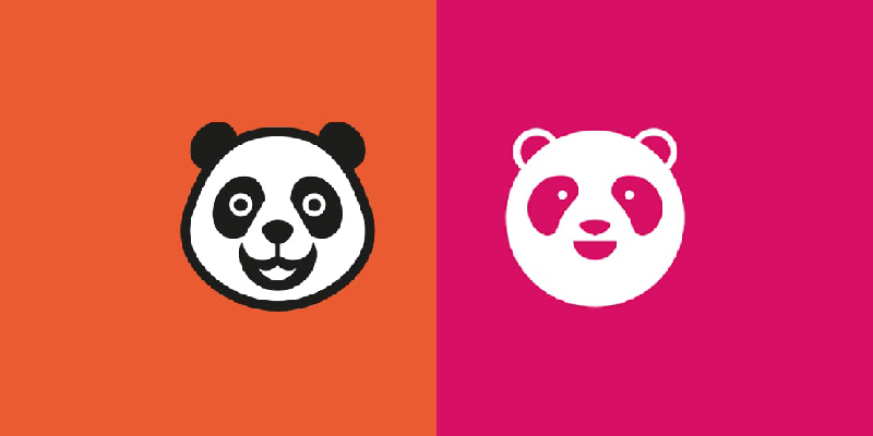
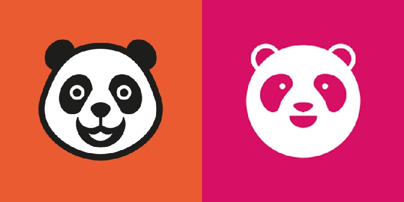
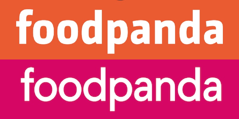
Back in 2012 Foodpanda had a rather different look to its eponymous character. The brand used an illustrated character who was slightly too comical to be taken seriously as a big brand logo. The idea was perfect, though the imagery just needed an overhaul.
The panda has been simplified somewhat over the years and reduced to just the head.
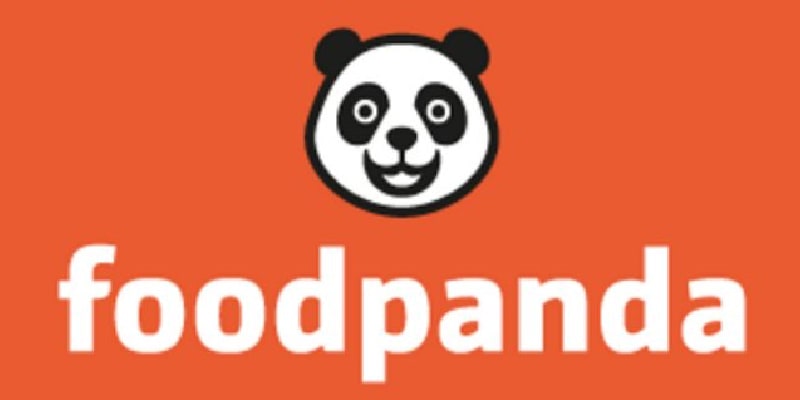
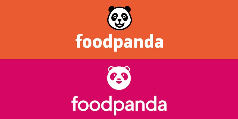
In a saturated market like food delivery services, a company needs to be even brighter to stand out. Foodpanda decided to start using a brighter orange colour.
Rebrand
The rebrand followed an acquisition by tech giant Delivery Hero in 2016. In an increasingly crowded marketplace of food delivery services, having a vivid brand identity can leave a greater impression in the minds of potential customers.
Brand Colours
Foodpanda saw an opportunity to use a bright neon colour to attract customers' attention and has seized it.
Using this colour so prominently on their delivery riders, the company is trying to make people associate it with fast food. Historically, pink is a colour often associated with attracting female customers, yet both men and women order food, so it is unusual to see pink representing such a company.
"Pink will be a strong differentiator for foodpanda to stand out in markets in which orange is used extensively throughout the cities´ landscapes."
Laura Kantor, Head of Marketing, Foodpanda
The pink is also the signature colour of its sister Foodora. The rebranding rolled out globally in 190 cities across 12 countries, including Singapore, Malaysia, Hong Kong, the Philippines, Taiwan and Thailand.
When it comes to the brand colours representing Foodpanda's competitors, Deliveroo's teal pales in comparison, while Uber Eats' black/green combination blends in easily with any other vehicle on the streets. Foodpanda wins with its highly visible (hence easily recognisable) neon pink.

Brand Mascot
While cleverly changing the colour to attract new clients, thankfully they decided to keep the panda mascot.
The previous iteration of the panda stared into your soul; it demanded your attention and its eyes seemed to hypnotise you into ordering from Foodpanda and giving a fantastic review.
Whereas the new version, its friendly eyes have been simplified to small dots, which has been criticised on the website as being too small to see when the logo is reduced in size.
Personally I prefer the new version; I think it is far cleaner, more sophisticated and has a modern feel for a new decade. It ticks every box really: simple shape; no outline; duotone; and yet still remains cute, less aggressive and more intelligent than its predecessor.
Brand Font
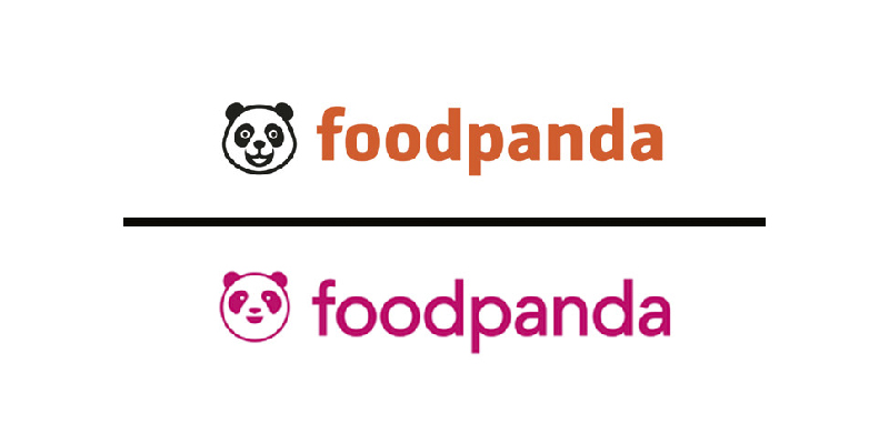
Along with the panda, the designers stripped back the font and put the wordmark on a diet.
The brand's font was changed and a more contemporary one was chosen in line with the brand's new direction.
They used a generic geometric typeface to complement the perfectly formed panda. It is less clunky and more rounded. For me, it is easier to read and gives off a smoother more efficient feel.
Touchpoints
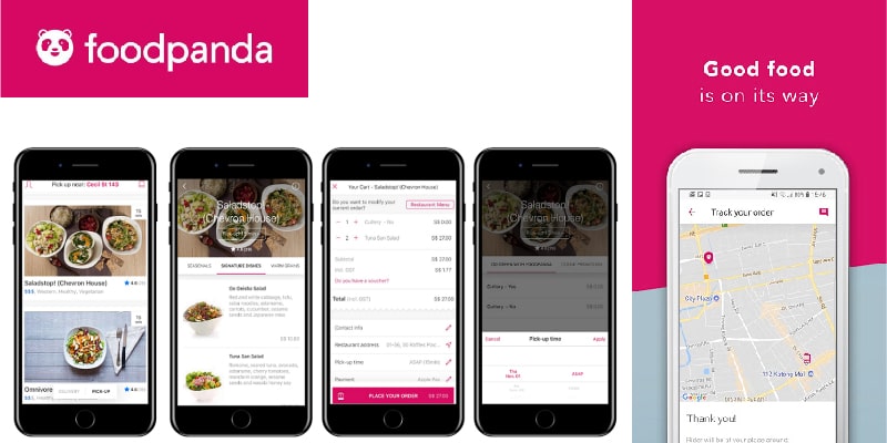
The company has revealed a new app, website and other digital platforms. When it comes to Ui/UX, the app is clean and user experience is at the forefront of the design. It is easy to use and great for tracking your food. Your recent orders are recorded, gives you food choices based on preference and also features pop ups with special offers and discounts on delivery.
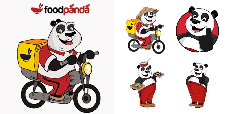
Food panda has declined to comment on how much the rebrand cost. They also have had to change the signage on over 1500 restaurant partners across Asia, uniforms for 5000 strong fleets of bikes. They have also removed the not so appealing orange colour and replaced it with neon pink on the walls of their Singapore head office.
However much it cost, I think it’s money well spent and it is definitely my go to delivery service.
related posts


about the author

about the author
Viv Harries is the Founder of Vivi Creative. He works with businesses to give them the creative edge with unique designs and a solid brand identity.