

Viv Harries is the Founder of Vivi Creative. He works with businesses to give them the creative edge with unique designs and a solid brand identity.
recent posts
- What's the Difference Between a Logo and a Brand Identity?
- How Much Does Brand Design Cost in the UK?
- What Is Branding? A Guide for Business Owners in 2026
- Thinking About Rebranding Your Business in Wales? Here’s What You Need to Know
- How to Build a Brand That Connects Emotionally with Your Audience

5 Best Rebrands of Recent Times
When you are starting out in business, branding might be the last thing on your mind. You are more concerned with who your customers are and when the first big payday is coming in, rather than looking at colours and fonts. However, concentrating on your brand identity from an early stage can really help your company in the long run.
You may have not spent a lot of time on your branding and are now realising that you should really have thought more about how you speak to your customers, rather than relying on your logo to be memorable enough for customers to return.
Somewhere down the line your businesses branding could stop working, so it may be time for a rebrand. Fortunately, rebranding is not uncommon and lots of large companies have gone through a rebrand process over the years.
Rebranding is the process of changing the corporate image of an organisation. It may be renaming, a new design or even market repositioning of an already established brand.
Rebranding is crucial for companies as they evolve; they must welcome new challenges to stay relevant and appear new and fresh to young audiences of potential consumers.
There are lots of reasons why a company needs to rebrand. It could be because of international growth and new management or maybe even a bad reputation that needs to be altered in the minds of the public. A lot of the time it is due to an outdated image and companies needing a new direction, look and feel for their company.
Brand identity constantly evolves and public opinion can change. A rebrand is more than just slapping a new logo on a product; it's about evolving the public's perception of a company.
It’s about helping your business and clients make a gradual switch from the old brand to the new, whilst keeping the same values and quality of service that they are used to.
If you are thinking about a rebrand for your company, here is the Vivi Creative guide to 5 of the best rebrands of recent times for inspiration.
Mastercard
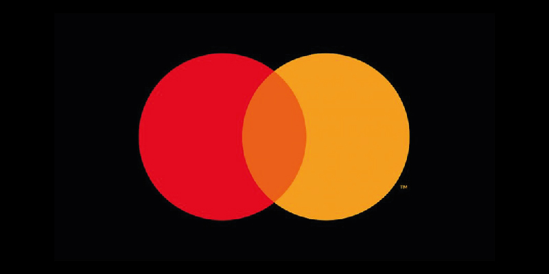
One of my favourite rebrands is Mastercard, who’s original logo was designed in 1968. They made some recent changes to their design and branding. The company, who is world renowned for its credit cards, actually removed their name from the logo, leaving only the intersecting circles for a very clean and modern design.
The move was made by the company as they wanted to be able to market themselves better across different forms of digital media. According to their research before the rebrand, more than 80% of people would recognise the brand without the name.
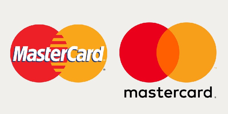
The red and yellow interlocking circles have been the hallmark of the Mastercard brand for more than 50 years; they symbolise its promise to connect people for infinite possibilities, with trust and confidence in a secure financial future.
Mastercard conducted more than 20 months of world-wide research to make sure people could identify it from the logo even without text.
"As the consumer and commerce landscape continues to evolve, the symbol represents Mastercard better than one word ever could, and the flexible modern design will allow it to work seamlessly across the digital landscape".
Raja Rajamannar, Mastercard Chief Marketing and Communication Officer
Uber
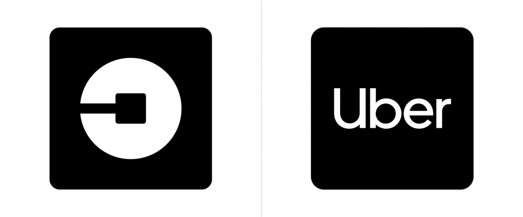
Uber was founded by Travis Kalanick and Garrett Camp in 2009 as a black car service for 100 friends in San Francisco. Its first logo was a red magnet designed by Camp, which was followed by a greyscale identity featuring a "U" in 2011.The new logo had been heavily criticised and their circular motif logo was likened to an "asshole", similar to the service that some customers were complaining about.
Uber had gone through a period where they had received a lot of bad press and their brand had become associated with negative attention and reviews on bad experiences. It was because of this that Uber actually decided to rebrand for the second time in 3 years.
With a new CEO came a new look and feel for the company, as they wanted customers to be reassured that there was a fresh start for Uber.
Uber had two key goals when they created their new brand: simplicity and global usage.
The old Uber logo emphasised the public’s hostility, imposing itself on customers with an all-caps, hyper-masculine aesthetic.
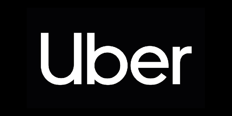
Uber’s new logo incorporates a sense of mobility, accessibility, and friendliness not found in previous iterations. They have achieved this by creating a custom designed lower case font.
The result is a clean, fresh look making Uber feel friendlier and more accessible to customers.
“We really wanted to celebrate the people that were part of the Uber ecosystem - the drivers, the riders and even the policymakers that were interested in safety, we wanted to think about simplicity and championing ease of use.”
Peter Markatos, Executive Creative Director at Uber.
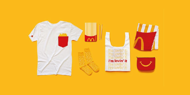
McDonalds
In January of 2016, McDonald’s announced its latest rebrand. The company is no stranger to refreshing its image, but this one joined the ranks of all-time important rebrands by giving the 35,000 stores in 125 countries a comprehensive overhaul in an effort to create harmony amongst the various branding that could be seen across the world.
McDonald’s unveiled new concept art and fresh store designs. With a modern, simple design that evoked a fresh and vibrant feel, the brand took inspiration from the “You deserve a break today” campaign from 1971.
McDonald’s golden arches are the cornerstone of the new identity, used simply, dynamically and playfully throughout the brand’s communications.
Under the new design rules, the iconic arches are free to stand on their own (previously, they had been locked with the word mark). As with brands like Nike and Apple, McDonald’s can “officially” be an icon brand.
“It’s one of the great logos of the world, and we should release its potential,”
Colin Mitchell, VP-director global brand McDonald’s
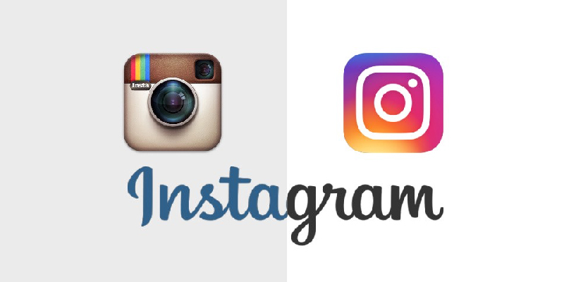
When Instagram revealed their new logo in May 2016, it had mixed reviews to say the least. Some people loved it, some hated it. It was dubbed, 'the rebrand heard around the world'. Along with a new logo, a new version of the app appeared on our phones. The fact that everyone was talking about it and had an opinion, made it one of the worlds most important rebrands.
So why did they do it? Six years after the photo sharing app’s launch, it boasted more than 400 million users posting photos each month and 80 million photos every day.
Well, Instagram was no longer just a photo sharing service so the old design had to go. They now have a suite of sub-brands including Layout, Boomerang, and HyperLapse. All were included in the new branding, unifying the look and feel of the app.
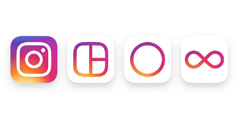
Personally, I prefer the new modern camera with rainbow gradient background. It screams “less is more,” which correlates to their goals for user experience. An easy logo for an easy-to-use minimalist app.
“While the icon is a colourful doorway into the Instagram app, once inside the app, we believe the colour should come directly from the community’s photos and videos.”
Ian Spalter, Head of Design Instagram
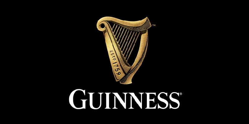
Guinness
Not that I am biased, but not only is this my favourite beer but I have always been fascinated by the amazing advertising campaigns created for this product over the years. Beer brands definitely don't come more recognisable than the Guinness Harp.
But how do you go about rebranding a company that’s over 250 years old? After all, Guinness was first brewed in Dublin in 1759. The task was taken up by Design Bridge in 2016 who wanted to create a contemporary version of the harp that represented the history of the company.
They decided to breathe more life into the flat trend design, giving the harp logo more detail and dimension. Working with a real harp, illustrator Gerry Barney was instructed to bring the logo to life. The final drawing could have been built into an actual working harp. The design was hand drawn and careful attention was paid to the accompanying script to ensure that the consumer understands the history, time, and significance attached to every bottle they buy.
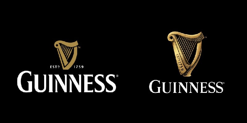
The Design Bridge company described it as a labour of love. Personally, I think this redesign leads by example when it comes to creating a new look for an established brand.
“The harp had begun to lack depth and character. It had become a distinctive shape with no soul. Our challenge was to breathe life back into the harp and let it sing once again…”
Tim Vary, Creative Director of Design Bridge
This is my choice of the 5 best rebrands of recent times, but I would be interested to hear your take on what has been successful! Please comment below to share your ideas.
Thanks for reading.
related posts

about the author

about the author
Viv Harries is the Founder of Vivi Creative. He works with businesses to give them the creative edge with unique designs and a solid brand identity.