

Viv Harries is the Founder of Vivi Creative. He works with businesses to give them the creative edge with unique designs and a solid brand identity.
recent posts
- What's the Difference Between a Logo and a Brand Identity?
- How Much Does Brand Design Cost in the UK?
- What Is Branding? A Guide for Business Owners in 2026
- Thinking About Rebranding Your Business in Wales? Here’s What You Need to Know
- How to Build a Brand That Connects Emotionally with Your Audience
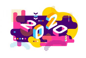
Logo Design Trends for 2020
In this series of blog posts we are going to look at some recent studies about trends in graphic design, web design and logo design for 2020. For this first post we are going to concentrate on logo design trends.
Bill Gardner of Logolounge has recently released the official 2020 logo trends report, which is put together after the careful analysis of over 350K logos, and explores how they have contributed to trends over the last 18 years.
This report is an observation on the logo industry and isn’t meant as a guide
for best practices. Trends are trajectories that will evolve and modify over
time, not a passing fad. Use the ideas here to push your design skills to
the next level and keep the trajectory moving to the next iteration.
Bill Gardner
I have been in touch with Bill and requested permission to share this report with you. So, it is with great pleasure that Vivi Creative presents the Logo trends for 2020. You can see the full report by clicking on the link: 2020 logo trends report
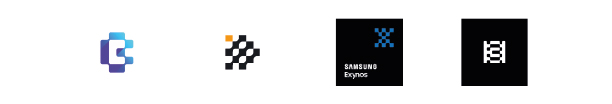
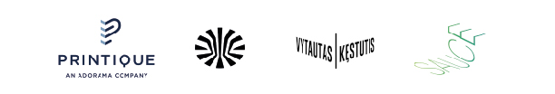
Counters: Geometric coloured shapes arranged around white space to form letters, numbers or symbols. These logos are less about the colourfully arranged elements floating on the background, but more about the negative counter space created between them.
Mazes: Parallel lines arranged to create a shape or letter, overlapping or intertwining. Having a guide for the journey that might otherwise be interminable is the underlying promise these marks address.
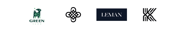
Sisters: Identical shapes that either mirror each other or are connected together whilst being rotated at an angle of 180 degrees. Like the siblings this trend is named for, the two distinct elements may be in perfect harmony or reference co-joined elements rife with tension. Regardless they will work it out. After all, they are family.
Chex Melt: A chequered style format used to create a form or shape through interlocking squares.They express the idea of multiple elements coming together to create a greater good, but corner-connecting just enough to maintain modest autonomy all the while keeping their social distance in check.
Bevel Tips: A leaf-like rounded shape that draws to a point. It serves as a refreshing addition on a number of stiff sans serif fonts, to add a wisp of nature and whimsy.
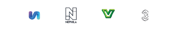
Petri Dish: Tightly grouped elements, framed in a geometric shape. This places faith in the public’s participation and their deductive skills at ferreting out the intended message.
Variable type: Thick to thin type transitions. Variable type on a strong pace to have an influence on logo trends for some years to come.
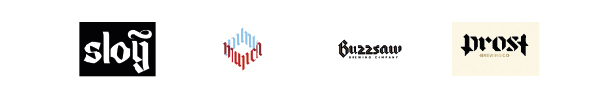
Black letter slab: Think dark letter forms, angled and Germanic style. It’s a perfect mouthpiece for demonstrating a client’s heritage, and craftsmanship and expresses both with inspired drama.
idrop: Coloured dots on the letter “i” or full stop of words. The lowercase “i” is often cast as the person in the letterform with the dot serving as the head. Often a few extra colored dots on letters that don’t really call for one, help describe the family or a team.

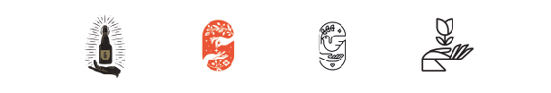
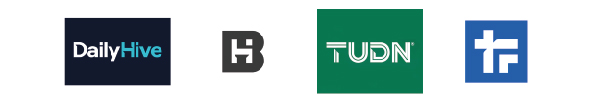
Hands: The use of hands or palms outstretched or holding an object. Handcrafted products seem to fit this genre, but more likely these are associated with an experience with an extraordinary promise.
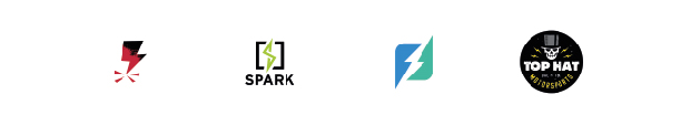
Bolts: Lightning bolt symbols. I like to think that these phenomenon represent an inexplicably awesome event. Stick around and it may happen again.
Twinkle: Star shape twinkling, used subtly around designs. This builds a good story of coming together to create a brilliant solution or a star from many. Remove any one of the pieces and the achievement vanishes.
Cornered: 3D dimension is added to symbol or letter form. These all reside on a flat plain of white that gives no hint of dimension, but that can serve as the perfect canvas for these to dimensionally exist in undefined space.
Letter illusions: Optical illusions used on the shape, letter or number. The use of graphic illusion is nothing new, but the abundance this year hints at a rediscovery of miraculous problem-solving skills and a unique perspective—or possibly the ability to teach your customers how to achieve the same.
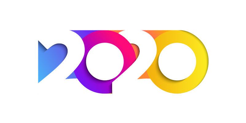
Chiseled Shadows: Shadows cut into letters or numbers at a 45 degree angle to create a 3D effect. I’m convinced these designs are less about crafting reality than they are about creating a dramatic fictional dimension, embellished by stark shadows with flexible rules.
Summary
2020 marks the 18th year of this one-of-a-kind report. Each year, it offers
the opportunity to literally review thousands upon thousands of logos one
at a time, looking for nuances and artifacts of emerging trends. As we
acknowledge that each design represents hours and hours of thought
and struggle from designers around the world, we are as humbled and
awed as ever by their dedication to the craft and grateful for the important
role they play.
Finding a logo designer can be a minefield for companies, as there are so many options available online and with varying prices and skill sets.
If you'd like to learn more about how to hire great logo designers you can read this article here by Toptal.com
Thanks for reading.
related posts
about the author

about the author
Viv Harries is the Founder of Vivi Creative. He works with businesses to give them the creative edge with unique designs and a solid brand identity.