

Viv Harries is the Founder of Vivi Creative. He works with businesses to give them the creative edge with unique designs and a solid brand identity.
recent posts
- What's the Difference Between a Logo and a Brand Identity?
- How Much Does Brand Design Cost in the UK?
- What Is Branding? A Guide for Business Owners in 2026
- Thinking About Rebranding Your Business in Wales? Here’s What You Need to Know
- How to Build a Brand That Connects Emotionally with Your Audience
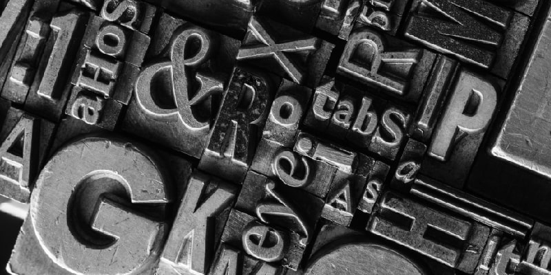
The Power of Typography
Typography involves the combining of different typefaces together in a meaningful and thoughtful composition. It is a very powerful tool that almost goes unnoticed and can have a lasting effect of people without them even knowing. So much emotion, feeling and style can be evoked from even a minimal difference in font choice. You can be playful, serious, traditional, even display strength or lightheartedness through a simple character weight. It is a time consuming and extremely important phase of any design job.
When it comes to typography, any designer who admits to using a wide variety of typefaces is probably trying to mislead you. Most designers have a selection of types that they love and like to re use on projects. I love asking designers about what their go to type face is as I find it fascinating to hear different opinions on design and to extend my knowledge of fonts.
We all have our favourites in life, whether it be films, art, food or even relatives! But to ask a designer to name their favourite typeface, now that is a tough question. There are so many options to choose from and to many amazing typefaces that all have their own charms. I bet there is even someone out there who loves Comic Sans. Well maybe not.
When I look at branding or design it is always the typeface that attracts my attention first. It is so important to nail down which type works for a design, that it can sometimes take hours/days of deliberation before agreeing on one that really represents what you are trying to accomplish.
The correct font can portray a brands personality uniquely and effectively telling your own authentic story visually. The subtle differences in font design can portray a host of different personality traits, evoke different emotions, create an opinion even subconsciously. Typography can change the way a customer thinks about a brand, it can create loyalty, trust and even an affectionate bond.
In this blog post I wanted to share with you some of my favourite fonts, how they are used and their own individual stories.
Typography is thinking made visible
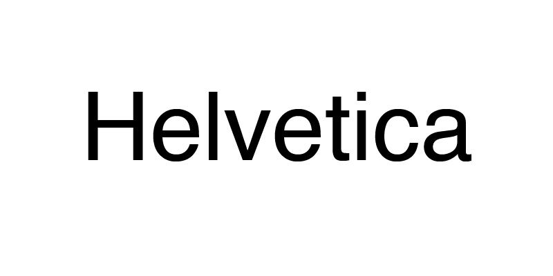
One of my favourite and personally I think understated fonts is Helvetica and Helvetica Neue.
It was originally known as Die Neue Haas Grotesk and was created by Swiss typeface designers called Max Miedinger & Eduard Hoffman in 1957. Their collaboration produced the idea of a neutral looking font with no specific meaning. The design was heavily influenced by the Akzidenz-Grotesk typeface created in 1898 by Berthold.
The name was changed to Helvetica, which is latin for Swiss, in an effort to market the font internationally in 1960.
Over the years it has become a favourite with designers across the globe, known for its clean, bold and modern look. A lot of large companies have adopted this typeface and made it part of our daily lives and modern culture. A lot of current social media channels use Helvetica, including Facebook and Whatsapp to name a few, who have maybe benefitted from its welcoming and friendly look.
At Vivi Creative we have been looking at how different brands use popular fonts, you can read about the use of Helvetica here.
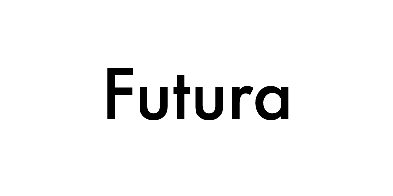
Futura was designed by Paul Renner in 1927 and is a geometric sans-serif typeface. It is based on geometric shapes such as the circle and is similar to the design and style of the Bauhaus Movement. It has an appearance of providing a forward motion due to the angle of the letting and presents a feeling of forwardness and efficiency. The flow of its triangles, rectangles and squares make it easy to use in any logo design.
Futura has grown in popularity over the years in the design community and is commonly used by some of the biggest brands and in some of the most famous logos in the world, including Nike, Paypal, Redbull and Dominos to name a few.
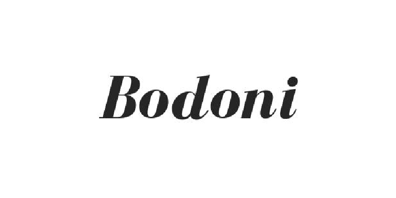
Bodoni is a serif typeface originally designed by Giambattista Bodoni in 1798. It is known for its thick and thin strokes and the extreme contrast between them. It was first used mainly in printed books in Italy in the 18th Century, before being adapted for advertising in the 21st century.
Famous brands who use Bodoni include the large fashion names such as Calvin Klein and Georgio Armani.
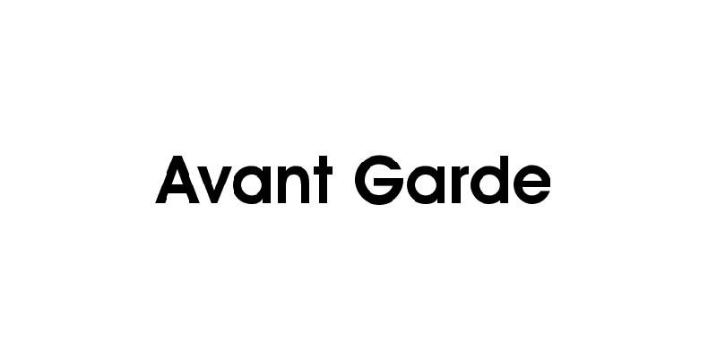
Avant Garde is another geometric sans serif type that is influenced by the Bauhaus movement in 1920's Germany. It is mainly used as a display font, used for headings and short sentences. It has become widely popular since its release in the 1970's and is used by many popular brands.
It is based on the logo font used in Avant Garde magazine and was developed by Herb Lubalin and Tom Carnase, who were partners in a design firm. They worked together to transform the idea into an entire typeface and logo concept. This typeface has been used by numerous brands all over the world, the most notable include Nutella, Adidas and Mobil.
At Vivi Creative we are lifelong students, studying design trends, typography and their uses in branding companies across the world. Let us know some of your favourite typefaces and how they are used today.
Thanks for reading.
related posts

about the author

about the author
Viv Harries is the Founder of Vivi Creative. He works with businesses to give them the creative edge with unique designs and a solid brand identity.