

Viv Harries is the Founder of Vivi Creative. He works with businesses to give them the creative edge with unique designs and a solid brand identity.
recent posts
- What's the Difference Between a Logo and a Brand Identity?
- How Much Does Brand Design Cost in the UK?
- What Is Branding? A Guide for Business Owners in 2026
- Thinking About Rebranding Your Business in Wales? Here’s What You Need to Know
- How to Build a Brand That Connects Emotionally with Your Audience

Rebrands that Failed - the cost of bad design
"If you think good design is expensive, you should look at the cost of bad design." — Dr. Ralf Speth. In the competitive world of business, branding plays a vital role in shaping consumer perception and establishing a company's identity. A successful rebrand can breathe new life into a business, attracting new customers and rejuvenating existing ones. However, not all attempts at rebranding yield positive results and the cost of bad design for a business can be catastrophic.
In this blog post from VIVI Creative, we will explore some examples of brand fails where companies invested significant resources into rebranding efforts that ultimately missed the mark.
We will also delve into the public's reaction to these design changes, sharing insightful quotes that highlight the impact of these failed branding attempts.
Tropicana's Packaging
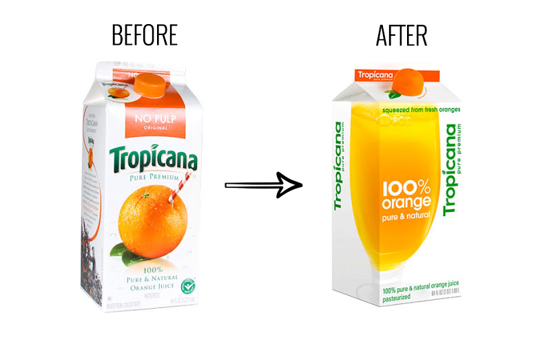
First up is Tropicana back in 2009, the renowned fruit juice brand, introduced a new packaging design intended to create a more modern and minimalistic look. However, the redesign left customers bewildered. The new packaging abandoned the classic imagery of a straw stuck in an orange, a longstanding symbol associated with Tropicana's fresh and natural identity. Consumers felt disconnected from the brand, leading to a significant drop in sales.
One customer expressed their disappointment, saying, "I felt like they had taken away my juice."
RadioShack's Reinvention

Also in 2009, RadioShack, an electronics retailer struggling to remain relevant in the digital age, attempted a rebrand. The company sought to reposition itself as "The Shack," reflecting a shift towards mobile devices and accessories. However, the name change and rebranding effort failed to resonate with consumers.
The move was widely criticized, with one industry expert commenting, "The name change is just one of many attempts that they've done to try and fix a much larger problem, which is really a lack of focus."
Gap's Logo Redesign
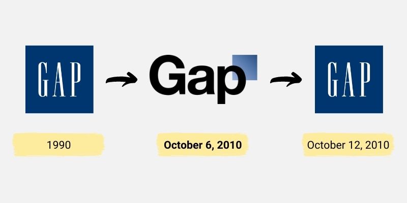
In 2010, the global clothing retailer Gap decided to revamp its iconic logo, aiming to modernize its image. However, the new design, a simple black and white logo with a small blue gradient box, was met with widespread criticism. Customers and design experts found the new logo uninspiring and even questioned its authenticity. Within a week, Gap reverted to its original logo following a barrage of negative feedback.
A marketing executive from Brand Keys aptly summarised the situation, stating, "There was such a visceral negative reaction... The worst thing you can do is invite ridicule."
The London 2012 Olympics Logo
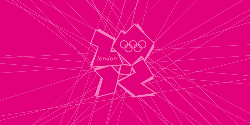
The London 2012 Olympics branding faced substantial criticism when its logo was unveiled. The design, featuring jagged shapes and vibrant colours, sparked confusion and distaste among the public. Critics argued that the logo lacked cohesion and failed to represent the spirit of the Olympic Games. Some even went as far as to compare it to a distorted swastika.
Jonathan Glancey, architecture and design editor for The Guardian, stated, "This is the kind of thing that gives design a bad name."
Uber's Rebrand
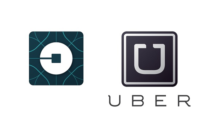
In 2016, ride-hailing giant Uber introduced a rebrand that aimed to signify its evolution beyond just a transportation service. The new logo, a geometric shape resembling a backward "C," puzzled customers. Many found it difficult to associate the new design with Uber's core business. The rebranding was met with mixed reactions, with one user describing it as "a mathematically incorrect icon for a car company." While Uber's intentions were to signal a broader focus, the execution fell short of achieving a clear and memorable identity.
Rebranding a business
Rebranding is a high-stakes endeavor that requires careful consideration and understanding of a brand's core values. The examples mentioned above highlight the importance of conducting thorough market research and listening to customer feedback before implementing major design changes. A failed rebrand can not only result in financial losses but also damage a brand's reputation and alienate its loyal customer base.
These brand fails serve as reminders that successful rebranding requires more than just a superficial makeover. It necessitates a deep understanding of the brand's identity, values, and target audience. Companies must strike a delicate balance between staying true to their essence while adapting to the evolving needs and preferences of consumers.
In the case of Gap, the attempt to modernise their logo backfired due to the lack of resonance with customers. The negative reaction highlighted the importance of maintaining the authenticity and familiarity of a well-established brand.
Tropicana's packaging debacle demonstrated the significance of visual cues and symbols in building a strong brand identity. By discarding their iconic imagery, Tropicana disconnected from their loyal customers, leading to a significant decline in sales. This example underscores the importance of understanding the emotional connection consumers have with a brand's visual elements.
RadioShack's failed reinvention illustrates the dangers of addressing larger underlying issues through a rebranding effort alone. While the name change aimed to reflect a shift in focus, it failed to address the fundamental challenges faced by the company. Successful rebranding requires a holistic approach that considers the brand's overall strategy, product offering, and customer experience.
The London 2012 Olympics logo backlash serves as a cautionary tale about the risks of pushing boundaries too far. While the intention was to create a bold and dynamic design, the public's reaction demonstrated that a brand's visual representation should be carefully crafted to resonate with its target audience and reflect its core values.
Uber's rebranding controversy highlights the need for clarity and coherence in design. The geometric logo failed to effectively communicate Uber's core business, leaving customers perplexed. This example emphasises the importance of aligning the rebranding strategy with the company's positioning and ensuring that the new design is easily identifiable and memorable.
In conclusion, brand fails resulting from costly rebranding mistakes serve as valuable lessons for companies seeking to refresh their image. Thorough market research, understanding consumer sentiment, and maintaining brand authenticity are essential components of a successful rebrand. By learning from these examples, businesses can navigate the complexities of rebranding and avoid the costly pitfalls that come with brand fails. Remember, a well-executed rebrand can be a powerful tool for growth, but a poorly executed one can have long-lasting consequences for a brand's reputation and bottom line.
related posts


about the author

about the author
Viv Harries is the Founder of Vivi Creative. He works with businesses to give them the creative edge with unique designs and a solid brand identity.