

Viv Harries is the Founder of Vivi Creative. He works with businesses to give them the creative edge with unique designs and a solid brand identity.
recent posts
- What's the Difference Between a Logo and a Brand Identity?
- How Much Does Brand Design Cost in the UK?
- What Is Branding? A Guide for Business Owners in 2026
- Thinking About Rebranding Your Business in Wales? Here’s What You Need to Know
- How to Build a Brand That Connects Emotionally with Your Audience

Rebrand Case Study Mailchimp
Today we have the pleasure of featuring a guest post by Stephen Houraghan from the Brand Master Academy who has written this amazing case study on Mailchimp and how they have repositioned and rebranded the company since they began back in 2002.
Looking at how successful brands have changed over the years is fascinating. How businesses subtly change and modernise their brand as the years go by, altering their trajectory of their company in the marketplace.
For anyone interested in branding, or looking for inspiration on how to go about a rebrand for a client, then this article is worth a read.
Brand History

About 20 years ago, a couple of web designers, Ben Chestnut and Dan Kurzius saw an opportunity in the market.
In the early 2000’s email software for businesses was expensive and clunky and reserved for the bigger end of town.
If you were a small business wanting to leverage this growing phenomenon that was email, forget about it.
Then Mailchimp was born, enabling the “small fish” to play in the “big fish” pond, with high-end tools, resources and technology made available at affordable prices.

Both founders Ben and Dan came from entrepreneurial families. Their understanding of small business needs kept the platform nimble, adding functionality wherever required.
That evolution has never stopped and Mailchimp continues to grow, evolve and adapt to the needs of their small business customers.
Case Study :- Repositioning Strategy
Mailchimp has always been adapting to meet the needs of their small business customers adding features and functionality here and there.
That said, they always stayed in their lane as an “Email Platform”.
But an expansion of features to include in-depth marketing executions services including Facebook Ads, signalled a change that was more than just “added features”
This wasn’t just an extra checkbox that shared an image or a link.
This was a full Facebook Ads Campaign Feature allowing users to create, launch monitor and optimise Facebook ad campaigns right from within the Mailchimp platform.
An Audience Led Reposition

Although Mailchimp has innovation in its blood, the leadership team didn’t decide on a reposition for the sake of innovation. Nor did the idea of a reposition come entirely from their own sense of innovation.
As any brand manager worth their salt should know, if you listen to your customer, they’ll tell you exactly what to sell them.

According to CEO Ben Chestnut
Our customers tell us that MailChimp helps them look pro and grow. It’s not an email platform, it’s not a newsletter tool—it’s the thing that helps them look more professional. That insight gave us a feeling of liberation. We don’t just have to do email. So we began talking to customers with that in mind.
The change in direction was an organic one and begun by simply altering how they talked to customers.
Mailchimp’s evolution and direction from an “Email Software” to a “Marketing Platform” was confirmed when he told the New York Times:
The next phase of MailChimp, he said, is to become a one-stop shop for the entirety of a small business’s marketing needs.
Case Study:
Adjusting The Brand Message

Repositioning an existing brand with a strong and loyal following is not easy.
Repositioning by definition is taking a different position in the market, therefore wanting to mean something different to both your existing audience your new audience.
It’s a balancing act of making your existing customers feel that they’re still the apple of your eye, while holding out your hand to appeal to the broader audience.
Brand Communication For The Bigger Picture
Prior to 2016, communication from Mailchimp was all geared towards role of email in small businesses.
In 2016, it began its transition with simple adjustments to messaging and copy.
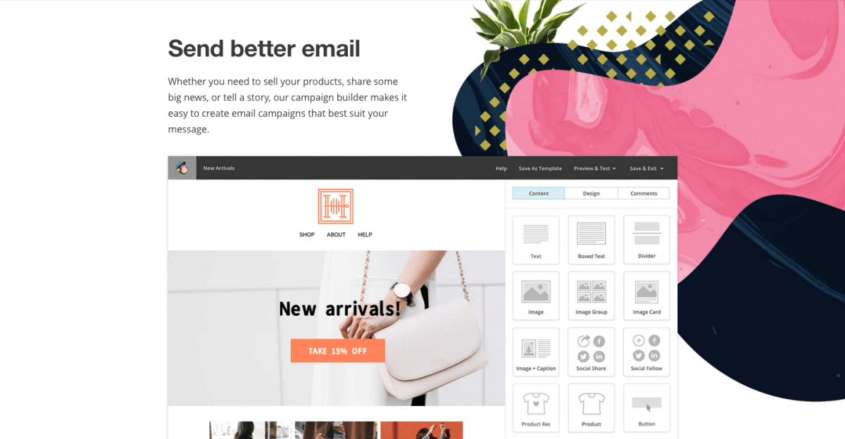
They slowly moved away from “What they did” to “The Outcome Of What They Did”.
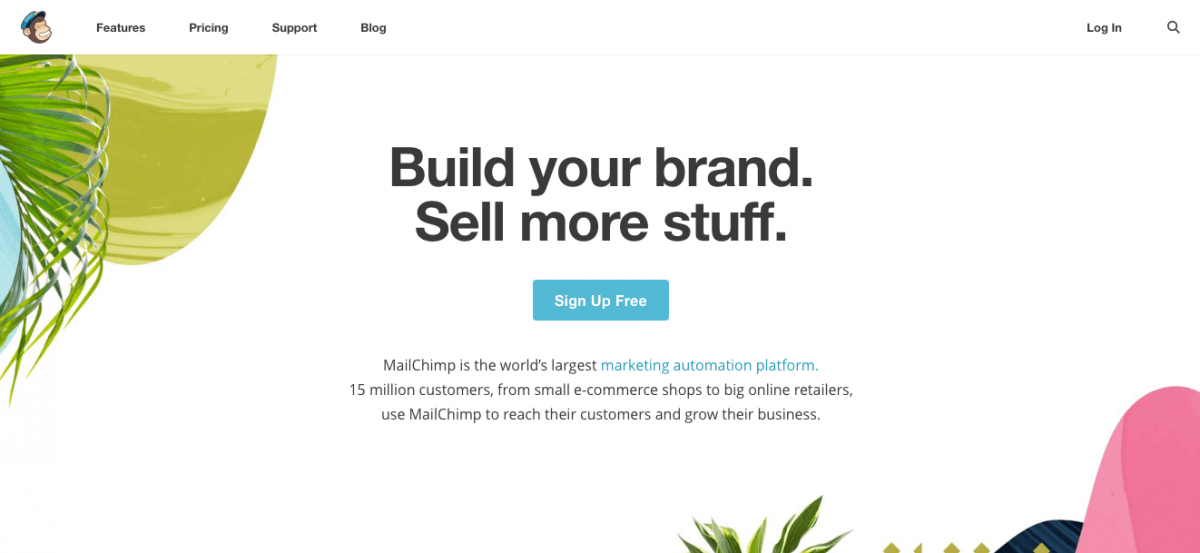
Instead of their homepage greeting users with the “Easy Email Newsletters” headline, it read “Build Your Brand, Sell More Stuff”.
This was an insight into what was coming in their shift towards helping small business owners to do more of what makes them grow, i.e. “Sell More Stuff”.
Mailchimp have readjusted the hierarchy of their messaging and though “send Better Email” can still be found in their messaging, today, it’s all about how they help their customers achieve their end goal.
Case Study:
Brand Personality & Voice

Since its inception, Mailchimp has presented as a fun and quirky brand that doesn’t take itself too seriously.
Their fun-loving mascot chimp Freddie, hasn’t once dropped his smile and that smile has consistently played out across all channels for 20 odd years.
A reposition for a brand that has come from humble beginnings without any venture capital to bringing in a revenue of over $400 million before their repositioning, it would have been easy for Mailchimp to lose the quirkiness.
To trade in that light-hearted unserious approach for a more sophisticated look and tone that comes with expanding market shares and growing revenues.
But Mailchimp is a brand with strong roots.
A Tone Of Voice With A Joke

Any student of branding looking to beef up their skills to develop a tangible tone of voice can look to Mailchimp’s Content Style Guide for inspiration
When they create messages or write copy, this is how they approach it.
We are plainspoken.
We understand the world our customers are living in: one muddled by hyperbolic language, up sells, and over-promises. We strip all that away and value clarity above all. Because businesses come to Mailchimp to get to work, we avoid distractions like fluffy metaphors and cheap plays to emotion.
We are genuine.
We get small businesses because we were one not too long ago. That means we relate to customers’ challenges and passions and speak to them in a familiar, warm, and accessible way.
We are translators.
Only experts can make what’s difficult look easy, and it’s our job to demystify B2B-speak and actually educate.
Our humour is dry.
Our sense of humour is straight-faced, subtle, and a touch eccentric. We’re weird but not inappropriate, smart but not snobbish. We prefer winking to shouting. We’re never condescending or exclusive—we always bring our customers in on the joke.
Case Study:
A Creative Brand Culture

Mailchimp’s leadership team is driven by innovation.
As Ben Chestnut reflected
I had a subscription to Businessweek. I’d get it and flip to any story about inventive companies
There was always a weirdo pushed into a spare room to invent stuff and drop stuff.
So that’s how I run my business. I only hire weirdos and let them fail all the time

Mailchimp is full of employees who are given the freedom for creative expression, who believe in the brand and who want to be there and their about us page on their website is a great example of employer branding.
Mailchimp works to create a company culture that sustains a creative, humble, and independent workforce and encourages a healthy work-life balance. Our employees have opportunities to help small businesses grow, attend events, share their work, and take time off to volunteer or learn new skills. And, we’re hiring.
Case Study:
A Quirky Brand Identity
Although the brand retained their tone of voice as they emerged into their new position, their quirkiness within their identity was a shoo-in for the chop.
As cute as Freddie was with his funky man bag and his “can-do” attitude, Mailchimp was moving up in the world the surely couldn’t take Freddie with them.
He was to be shipped off to a farm where he would have space to run around and play with other postal chimps.

After all, this was another tech company in the modern era.
Surely the likes of Google, Airbnb, Spotify and Pinterest knew something that Mailchimp should have been noting after they all dropped their more playful typography for the no-nonsense straight-laced sans serif.
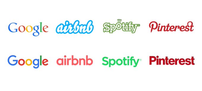
But no, Mailchimp went the opposite way and doubled down on their quirkiness with their “Playful and expressive” or downright outrageous rebrand with the help of Collins branding agency.
The Identity Rebrand:
The Logo & Wordmark

We’re delighted that Freddie didn’t get the chop.
He’s alive and well and looking better than ever.
Not only that, his simplified look means he has now become a more central figure and is used generously in any space and on any platform.
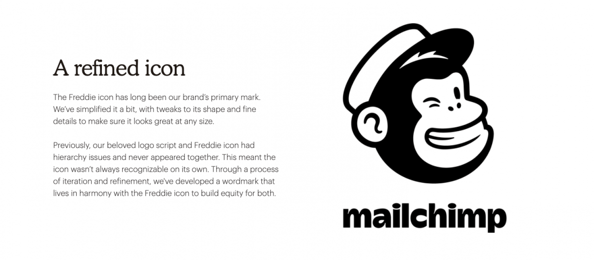
The accompanying wordmark is as playful as the brand’s voice and the lowercase “c” contrasting from it’s previous capital appearance further states the brand name as a single component.
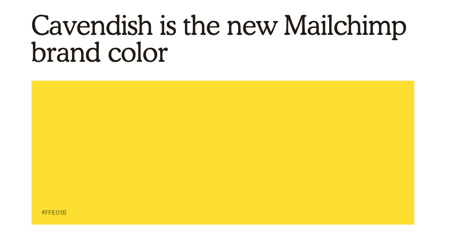
The Identity Rebrand Colour Palette
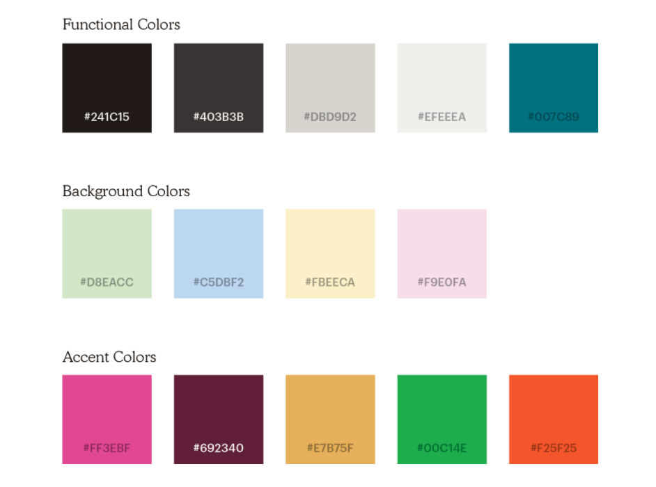
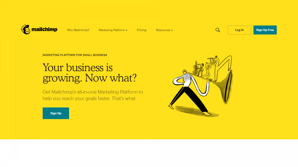
Mailchimp is energetic and fun-loving at heart and no colour sums up those characteristics better than their dominant Cavendish Yellow.
Though the brand has an extensive pallet they are heavily focused on their dominant colour.
Why do they lead so heavily with such a bold colour?
We anchor on a single colour, used with purpose, to drive consistency across all properties.
The Identity Rebrand Typography

Mailchimp has gone against the grain of the technology industry and most brands in the world for that matter with a typeface from the 1920’s.
Cooper Light is a lighter version of the rounded serif typeface designed by Oswald Bruce Cooper in 1919, which went on to have its heyday in graphic design in the 1970’s.
As Mailchimp highlights,
You may have seen its larger cousin on dusty old funk records and inside questionable sandwich shops.
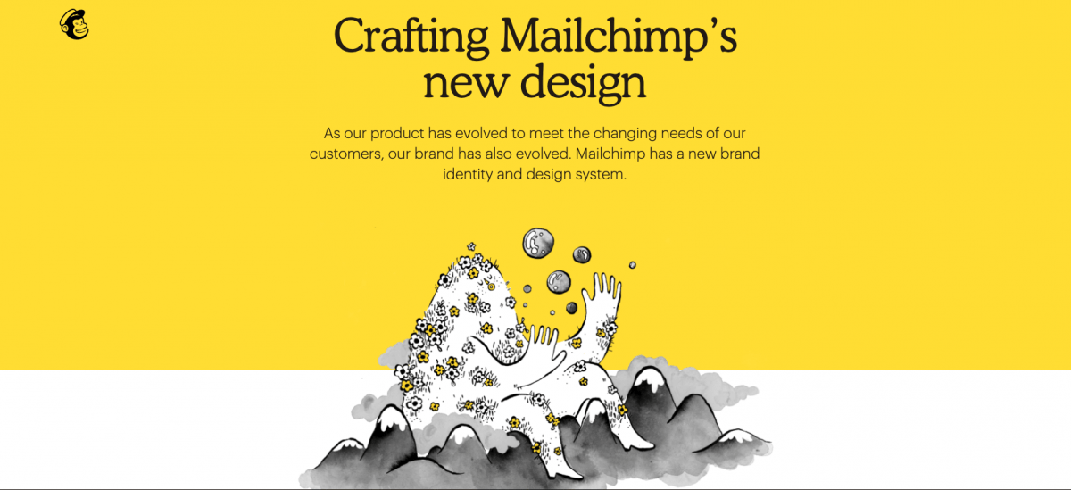
The Identity Rebrand Illustrative Image Style
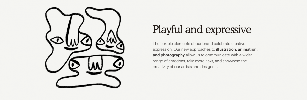
Quirky illustrations have become a trend in the technology sector to the point that stock houses have now been flooded with extensive libraries, thus extending the trend.
Although Mailchimp’s image style could certainly be categorised as “Quirky Illustrations”, their quirkiness goes way beyond where other tech companies would dare to venture for fear of scaring off their software loving audiences.
Thank you for reading.
related posts


about the author

about the author
Viv Harries is the Founder of Vivi Creative. He works with businesses to give them the creative edge with unique designs and a solid brand identity.