

Viv Harries is the Founder of Vivi Creative. He works with businesses to give them the creative edge with unique designs and a solid brand identity.
recent posts
- What's the Difference Between a Logo and a Brand Identity?
- How Much Does Brand Design Cost in the UK?
- What Is Branding? A Guide for Business Owners in 2026
- Thinking About Rebranding Your Business in Wales? Here’s What You Need to Know
- How to Build a Brand That Connects Emotionally with Your Audience
Logo designing secrets
A logo is the hallmark that defines a company's identity. It's the first impression, the lasting memory, and the beacon that guides customers to your business. A masterfully crafted logo speaks volumes about your brand's values, mission, and uniqueness. In this article, VIVI Creative will delve into the art of creating memorable logo designs – uncovering the secrets of success and learning from design missteps.
The Anatomy of Memorable Logos
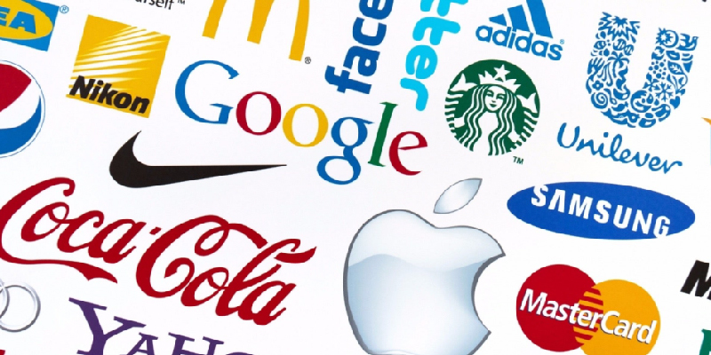
A memorable logo is a symphony of simplicity, relevance, and creativity. Think of some of the iconic logos – Apple's sleek apple, Nike's swoosh, or the golden arches of McDonald's. These symbols instantly trigger brand recognition, and there's a reason behind their success.
1. Simplicity Is Timeless
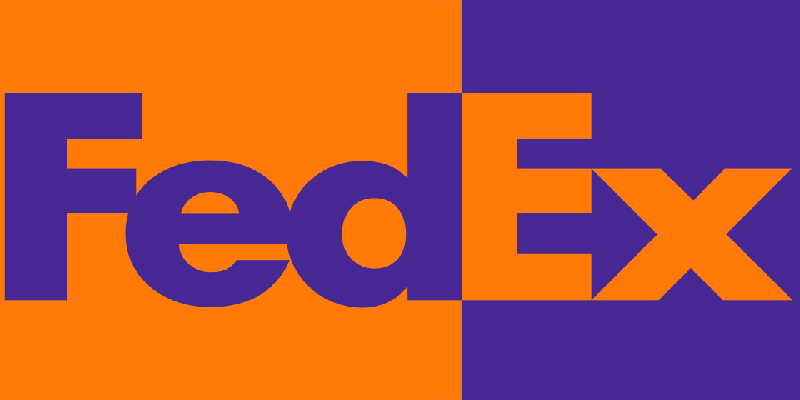
Simplicity is the cornerstone of a memorable logo. A cluttered design can overwhelm and confuse, while a simple, clean design ensures your logo is easily recognisable across various platforms and sizes. Take the FedEx logo, for instance. Its clever utilisation of negative space to create an arrow within the lettering subtly conveys the concept of movement and efficiency.
2. Relevance Sparks Connection
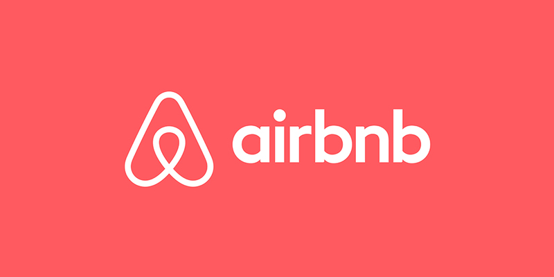
A successful logo encapsulates your brand's essence. A tech company wouldn't opt for a playful, handwritten font, just as a children's bookstore wouldn't choose a somber, corporate style. Consider Airbnb's logo – a simple, heartwarming design that reflects their core message of finding a welcoming home away from home.
3. Creativity Leaves an Impression
Creativity is the spark that sets your logo apart. Amazon's logo, with its arrow connecting A to Z, not only signifies the variety of products they offer but also implies seamless service from start to finish. A creatively designed logo engages viewers, inviting them to explore the story behind the symbol.

Now, let's examine two emblematic logos that showcase these principles in action.
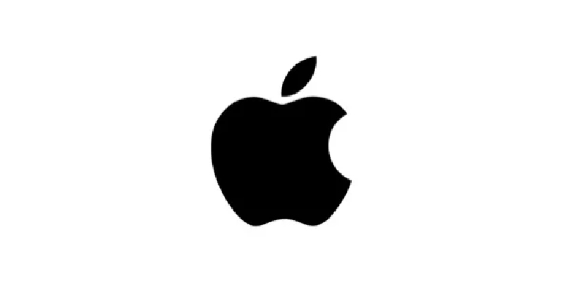
Apple
The bitten apple needs no introduction. It's an epitome of minimalism – a sleek silhouette with a single bite taken out. This simplicity resonates with Apple's commitment to user-friendly, sleek design. It's a symbol that signifies innovation and elegance.
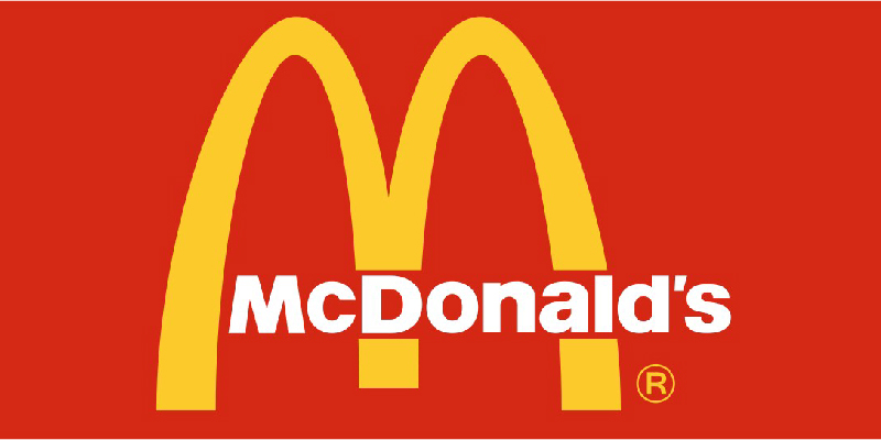
McDonald's
The golden arches are universally recognisable. While not a literal representation of hamburgers, they have become synonymous with the brand. The arches create an M, standing for McDonald's, and their vibrant yellow colour exudes warmth and joy.
Process of Designing a Logo
The journey from concept to a memorable logo involves several stages:
1. Research
Before pencil meets paper, comprehensive research is the foundation of a successful logo design. Dive into understanding the brand's core values, mission, and the unique selling points that set it apart. Analyse the target audience's preferences and demographics. Investigate the industry landscape to identify design trends, competitor logos, and opportunities for differentiation.
2. Conceptualisation
With insights gathered from the research phase, it's time to let creativity flow. Brainstorm ideas that capture the essence of the brand. Consider symbols, shapes, and visual metaphors that align with the brand's identity and values. Sketch out preliminary designs without worrying about perfection at this stage. Think outside the box and explore various directions.
3. Simplification
From the array of ideas generated, narrow down your options. Choose designs that best resonate with the brand's story and message. Begin refining these designs, focusing on clarity and simplicity. Eliminate any unnecessary elements that could clutter the design. Remember, a simple logo is often the most memorable.
4. Digitalisation
Once you've honed in on a refined sketch, it's time to bring it to the digital realm. Utilise design software to translate your hand-drawn concept into a digital format. This step allows for precision and flexibility during further iterations and adjustments. Focus on capturing the details and ensuring that the digital version aligns with your vision.
5. Feedback and Iteration
Seeking feedback is a crucial step in the design process. Share the digital version of the logo with stakeholders, clients, or team members. Listen to their insights and critiques, and use them to refine and improve the design further. Iterate based on the feedback received, keeping in mind the brand's identity and goals.
6. Colour and Typography
Colours and typography play a pivotal role in conveying the brand's personality and emotions. Select colours that resonate with the brand's identity and evoke the desired emotions in the audience. Choose typography that complements the logo's visual elements and aligns with the brand's voice. Strive for harmony between colour, typography, and overall design.
7. Versatility Testing:
A logo must be adaptable across a variety of mediums and sizes – from business cards to billboards. Test the logo's versatility by applying it to different contexts. Ensure that it remains clear and recognisable whether scaled down to a small size or blown up to a larger-than-life scale. This step confirms that the logo will maintain its impact across various platforms.
By meticulously navigating through these stages, we're not only creating a logo; we're shaping a visual identity that captures the essence of the brand. Each phase contributes to the logo's success, from its initial concept to its adaptation in real-world applications. Remember, the logo is the face of the brand, and this process ensures it speaks volumes in the language of design.
In the world of design, every curve, colour, and concept matters. It becomes abundantly clear that the creation of a memorable logo is no mere task – it's an artful orchestration of strategy, creativity, and profound understanding.
Crafting an emblem that resonates with a brand's ethos requires more than visual prowess; it necessitates a deep exploration of the brand's essence, a mastery of simplicity, and an unwavering commitment to authenticity. The stories of logos that have withstood the test of time stand as testament to the enduring power of an image that transcends pixels and ink.
Remember that the journey of logo design is a continuous evolution, mirroring the very growth of the brands it represents. It's a journey where research shapes vision, where sketches breathe life, and where collaboration refines brilliance.
Here's to logos that inspire, logos that endure, and logos that stand as beacons of brand identity for generations to come.
Thanks for reading.
related posts

about the author

about the author
Viv Harries is the Founder of Vivi Creative. He works with businesses to give them the creative edge with unique designs and a solid brand identity.