

Viv Harries is the Founder of Vivi Creative. He works with businesses to give them the creative edge with unique designs and a solid brand identity.
recent posts
- What's the Difference Between a Logo and a Brand Identity?
- How Much Does Brand Design Cost in the UK?
- What Is Branding? A Guide for Business Owners in 2026
- Thinking About Rebranding Your Business in Wales? Here’s What You Need to Know
- How to Build a Brand That Connects Emotionally with Your Audience
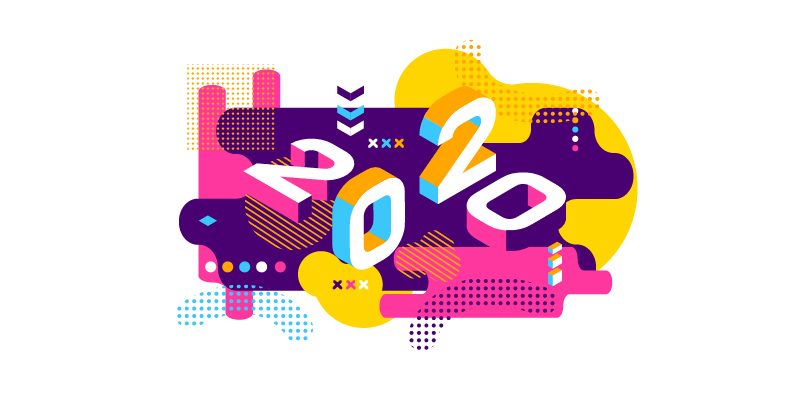
Web Design Trends for 2020
In this blog we are going to continue our series on design trends for 2020, by looking specifically at web design.
A new decade brings new trends, and we are already seeing some trends that are growing in popularity in web design and Ui (user interface) design.
This year has been a strange one so far with Covid 19 forcing people to self-isolate, unable to see friends and family and being forced to work from home. It has been a difficult time for many, especially people who live alone and have found themselves completely cut off from the world. The internet has made it so much easier to stay in touch through social media, and Netflix is helping to occupy our spare time. People are spending more time on social media than ever before and online companies are the ones that are flourishing, with Amazon recording record sales.
Some businesses have been hit hard; changes have had to be made as people have had to tighten their belts and find different ways to make money and explore different directions for their businesses to take. The world will change for the better after this, I hope. With more companies realising that their employees can work remotely, there may be less commuting and pointless travel, and a greater importance put on family values.
In tough times tough people emerge; in 2008 during the last financial difficulty businesses like Uber and airbnb were born. It will be interesting to see who rises from the fall out of this pandemic.
Being a designer, I have found that my daily life hasn’t changed massively, as I always sort of work in quarantine. Locked away from the world and glued to my computer screen. I’ve realised that many of us actually live in this little creative bubble, sharing work, designs and ideas with each other over a computer screen. We all love our job and couldn't think of anything else we’d rather do. It’s important to remember that we don’t work in complete isolation; we have a family of designers online from all different generations, that create work and trends that can impact our own designs, even subconsciously. Our designs can be affected by a multitude of things from popular culture, technology, social and economic trends. The world around us is constantly affecting visual ideas and the messages that we, as designers, send to the public.
Design trends in this industry are rather unpredictable; we are now in a digital age of ever evolving technology with limitless possibilities and endless content for everyone. As of January 2020, there are nearly 2 billion websites and 4 billion active internet users. Just let that sink in for a minute! That’s a lot of different tastes to cater for... Is everyone going to like the same style? No chance!
There are trends that are constantly popular, like minimalism and convention breaking typography. There are also some new ones evolving this year, such as dark mode and 3 dimensional elements, as designers embrace futurism.
So here is the Vivi Creative guide to web design and Ui trends for 2020.
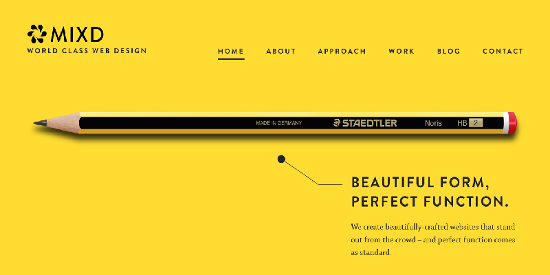
Use of white space
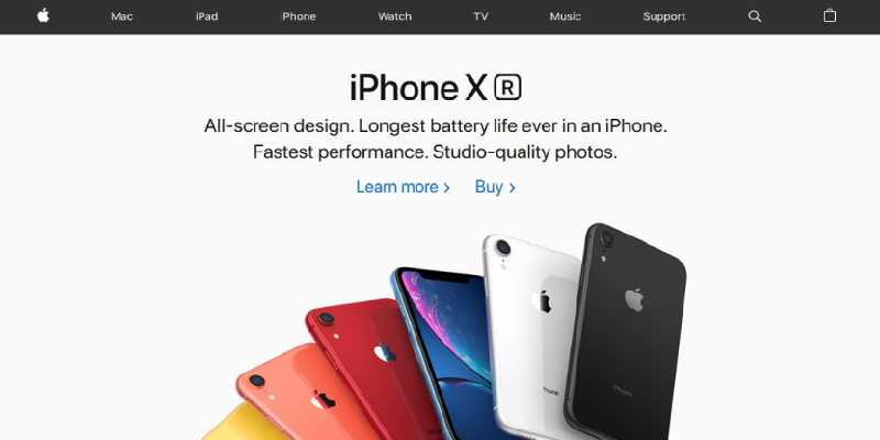
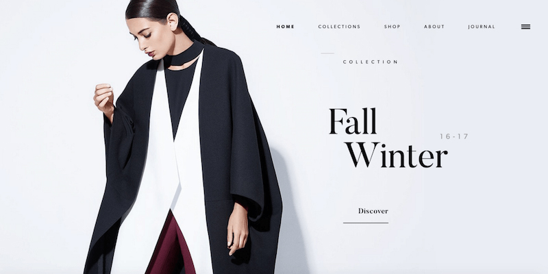
The key to good web design is to use white space (any colour space) wisely. It can give your images and text breathing room and gives your creations a canvas and a frame to allow messages to jump off the page. The white background helps to draw the user's eyes to the central detail and important elements. It stops customers from being distracted by anything apart from the main purpose of the site—to show off their wares.
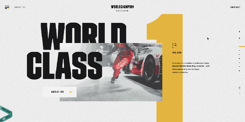
The Apple website is an excellent example of how to use white space. This is a classic minimalist trend and could even be described as uber minimalist! It makes sites easy to understand and use, while being elegant and beautiful at the same time.
Dark mode
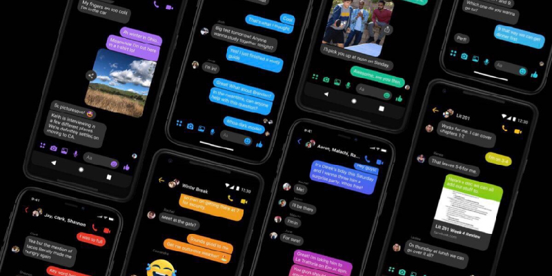
With the amount of time spent on screen these days, dark mode is designed to be easier on the eyes and it makes colours, typography and design elements pop. It improves the visibility of colours and creates truly dynamic design with neon lights being a popular accompaniment. Facebook messenger for example is one of the first to adapt this trend—love it or hate it it seems like this trend is here to stay.
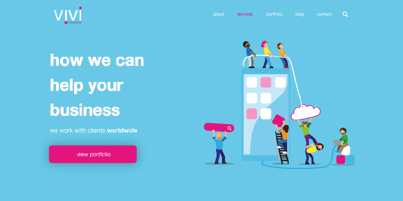
Hand drawn elements
Creating icons and elements for websites that look hand drawn are popular this year. They are fun, cheerful and brighten up designs with personality and a playful aspect. That can show off a brand’s personality and make you stand out from the competition. Below you can see how I used this for my own rebrand. The characters of my team were all individually drawn and they work together to build websites and apps.
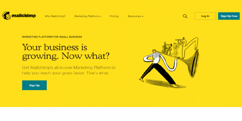
Mailchimp's rebrand uses a beautiful mix of minimalism and hand drawn elements.
Minimalism
This really flourished in 2019 and thankfully is here to stay. Less is more they say, especially in web design. There is no need for crowded space. Elements and images need space to breathe. Simple design is far more appealing to the eye and minimalism is a classic style that makes websites elegant and easy to understand and use.
Minimalist Navigation
With the future heading towards voice recognition and less text, navigation needs to limit its space. Also, with devices getting smaller as the years go by, design also needs to shrink to fit in. Designers are encouraged to use the bare minimum of text and icons and use the smallest amount of space in doing so.
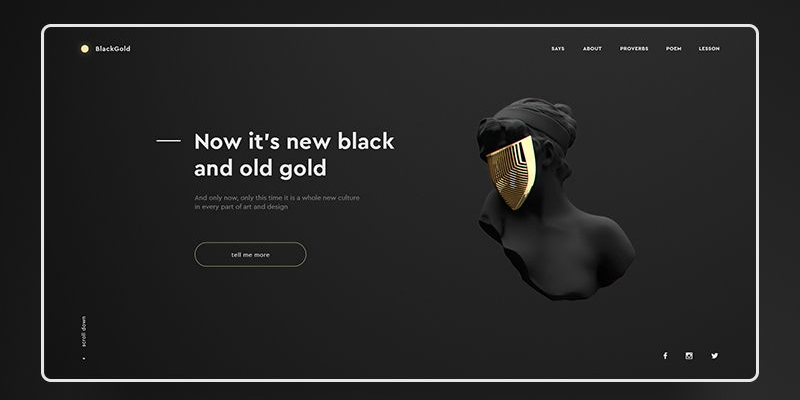
black gold
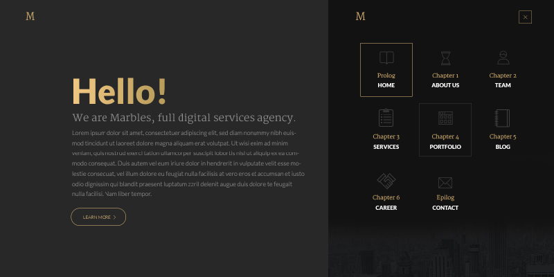
Marbles
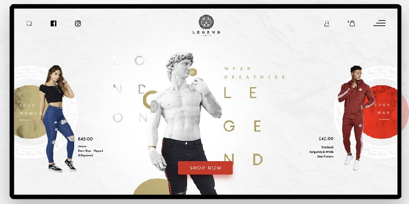
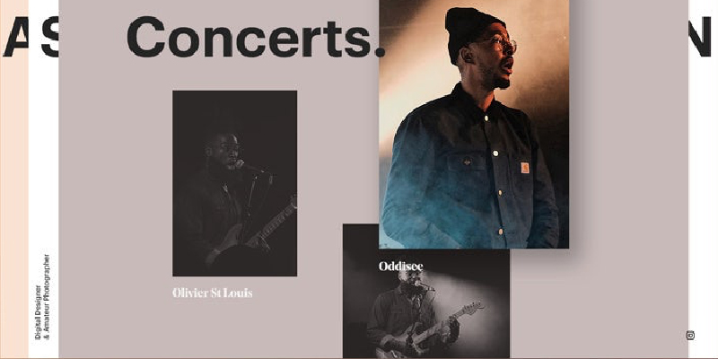
Mixing typography and photography
Creating memorable visuals by combining these two elements can create some awesome work. It is a collage style trend that has been around for years, but is very popular on landing pages.
Igor Vensko
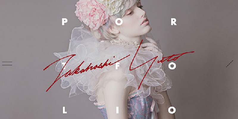
Yuto Takahashi
Luminous glowing colour schemes
The future has arrived—it is here! Sadly Blade Runners haven't turned up yet, but the style has. The neon, dystopian future feel with purples and hot pink glowing from computer screens. With extreme minimalism and dark mode on the rise this style can really flourish. These are perfect examples of how luminous colour and dark mode can be used to make companies key messages standing out dramatically.
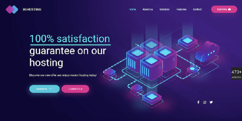
BEHosting
Soft shadows and floating elements
These are all about adding depth and detail to more simple designs; shadows can create this easily. With design becoming flatter and more minimalist, this can add an extra wow factor to typography and design elements.
JPS design has perfectly combined layers, soft shadows and floating elements.
Gilles Tossoukpé
Imperfections that add personality
By creating purposeful imperfections in their designs, businesses can convey personality and humanity to a website. They can also create an atmosphere of fun and playfulness with purposely messy designs.
sixdesign
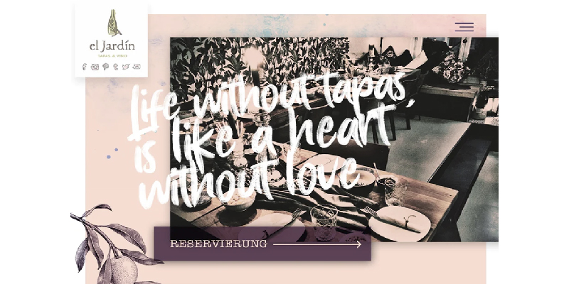
el Jardin
Layers that overlap
Overlapping layers don't really give a 3D effect but they do add a sense of depth to a website. You can overlap images, boxes, backgrounds, video, text—it really works with
almost any type of design scheme. While overlapping layers can come in the form of a single element, this trend often includes multiple overlapping elements and helps pages scroll, viewing a glimpse of the top section of upcoming articles or elements.
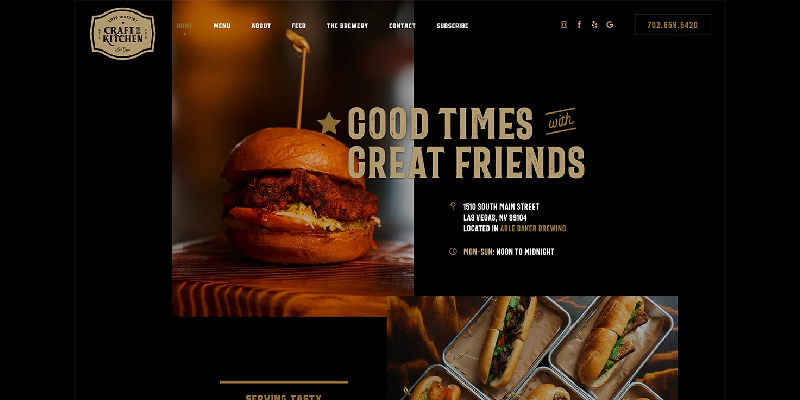
craft kitchen
Amsterdam Worldwide
Colour changing gradients.
Gradient colours are back with a bang in 2020. There was a time when minimalist, flat designers shied away from gradients. But now they are more prominent than ever, from bold backgrounds with multiple colours to subtle gradients of gentle colours blending sections of pages. It looks like gradients are here to stay and I’m rather glad about it.
Elken
Bariskuran
3D elements
We were used to only seeing 3D elements in games and on consoles, but with the ever growing power of devices is allowing more realistic elements. In 2020 we are seeing a great deal of 3D web designs both static and animated which can increase user participation in websites and decrease the problem of bounce rates.
With the new decade it looks like web designers are looking towards the future with attention grabbing visuals, neon colours and bold typography, to create a dystopian futuristic feel for 2020. Thankfully, they are still embracing trends from the past, with the use of white space and minimalism sticking around for the foreseeable future.
I am a big fan of the imperfections that are creeping into modern web design, especially with the illustrations—I feel it can really add depth and personality to a project.
Like all good designers we are influenced by old design styles and it is important for us to learn from what other creatives have done. It’s up to you whether you decide to follow trends or to break out on your own and rebel. Personally, I am a fan of deciding on what I like and pushing away what is not aesthetically pleasing to me design wise.
Everyone has different tastes and keeping everyone happy is, well, positively impossible. I have been lucky with the clients I have worked with, and I'm hoping my next client has style and taste, and will let me create a branded on trend feel for them that will propel their company into the 2020’s online market.
related posts


about the author

about the author
Viv Harries is the Founder of Vivi Creative. He works with businesses to give them the creative edge with unique designs and a solid brand identity.