

Viv Harries is the Founder of Vivi Creative. He works with businesses to give them the creative edge with unique designs and a solid brand identity.
recent posts
- What's the Difference Between a Logo and a Brand Identity?
- How Much Does Brand Design Cost in the UK?
- What Is Branding? A Guide for Business Owners in 2026
- Thinking About Rebranding Your Business in Wales? Here’s What You Need to Know
- How to Build a Brand That Connects Emotionally with Your Audience
The Psychology of Colour in Branding
Colour possesses a remarkable ability to influence our emotions, perceptions, and behaviors. In the world of branding, colour plays a crucial role in creating memorable experiences and communicating a brand's personality.
By understanding the psychology of colour, businesses can strategically harness the power of colour to forge strong connections with their target audience. In this blog post, VIVI Creative will explore the significance of colour in branding, we shall examine successful examples of colour usage by renowned brands, and highlight instances where colour choices have missed the mark.
The Psychology of Colour
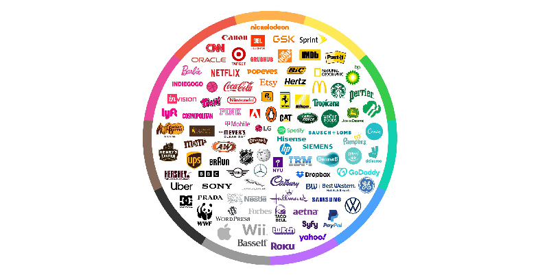
Colour psychology examines how different hues evoke emotional responses and shape our perceptions. Brands can tap into these psychological associations to elicit specific reactions from consumers. Here are a few examples of common colour associations:
What brands do need to remember that the associations with colours can vary across cultures and individual experiences. It's essential for brands to consider their target audience and the context in which colours will be used to effectively communicate their desired message.
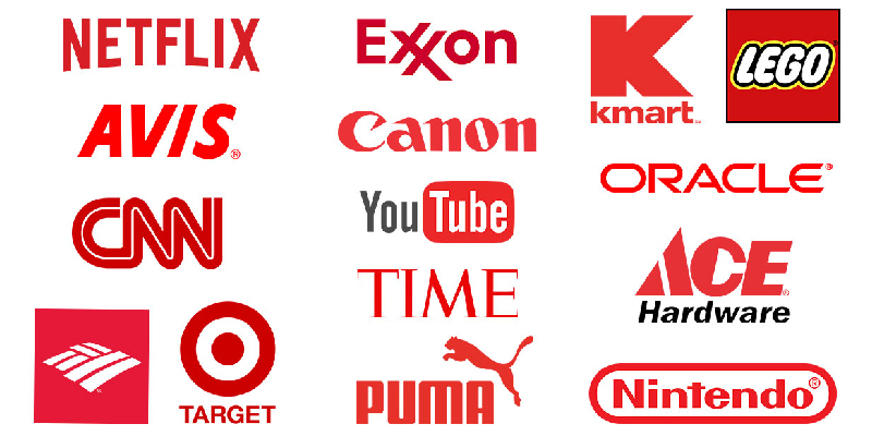
Red
Associated with energy, passion, and urgency, red is often used to create a sense of excitement and stimulate impulse purchases. Brands like Coca-Cola and Netflix utilise red to capture attention and evoke feelings of enthusiasm and boldness.
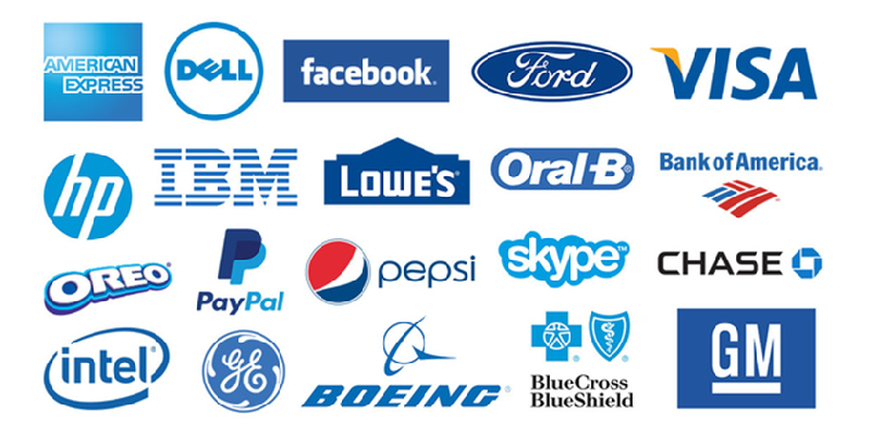
Blue
Symbolising trust, stability, and reliability, blue is frequently employed by technology companies (e.g., IBM, Intel) and financial institutions (e.g., American Express, PayPal) to inspire confidence and establish credibility.
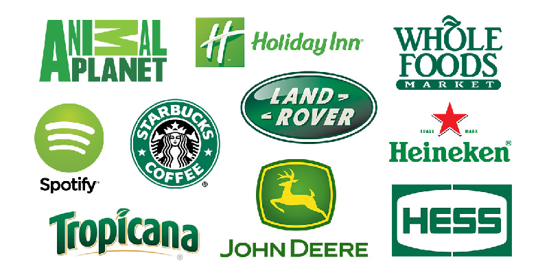
Green
Evoking nature, growth, and harmony, green is commonly associated with sustainability and eco-friendliness. Brands like Starbucks and Whole Foods use green to convey a commitment to the environment and healthier living.
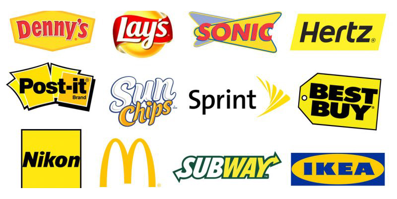
Yellow
Yellow is associated with optimism, happiness, and creativity. Brands like McDonald's, Snapchat, and Best Buy use yellow to evoke a sense of energy, playfulness, and positivity.
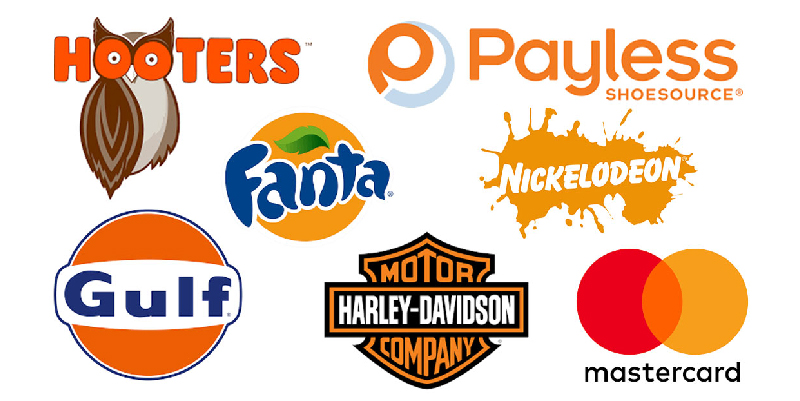
Orange
Orange is often associated with enthusiasm, warmth, and innovation. Brands like Amazon, Harley-Davidson, and Firefox incorporate orange to create a sense of excitement, approachability, and adventure.
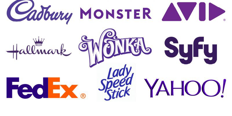
Purple
Purple is often associated with luxury, creativity, and spirituality. Brands like Cadbury, Hallmark, and Yahoo leverage purple to convey a sense of elegance, creativity, and uniqueness.
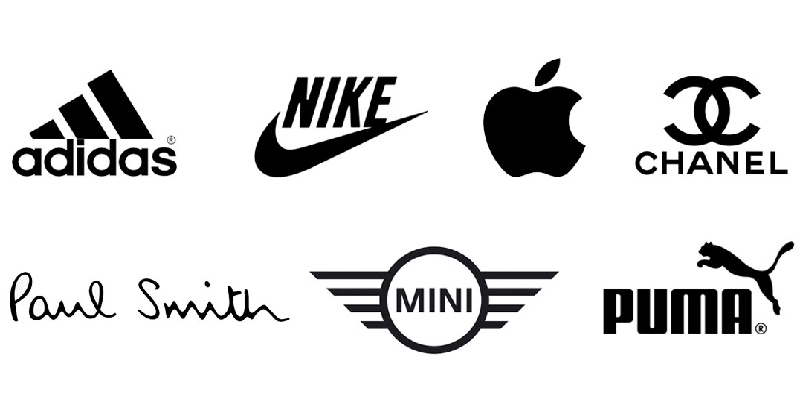
Black
Black is associated with sophistication, elegance, and authority. Brands like Chanel, Nike, and Adidas utilize black to communicate a sense of timeless style, power, and prestige.
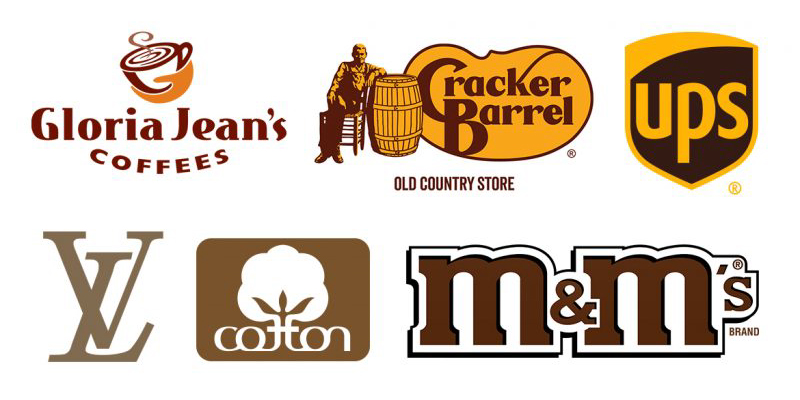
Brown
Brown is associated with earthiness, reliability, and warmth. Brands like UPS, Hershey's, and Timberland incorporate brown to evoke a sense of stability, trustworthiness, and connection to nature.
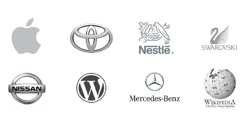
Gray
Gray is often associated with neutrality, professionalism, and balance. Brands like Mercedes-Benz, Apple, and Adobe utilise gray to convey a sense of sophistication, maturity, and professionalism.
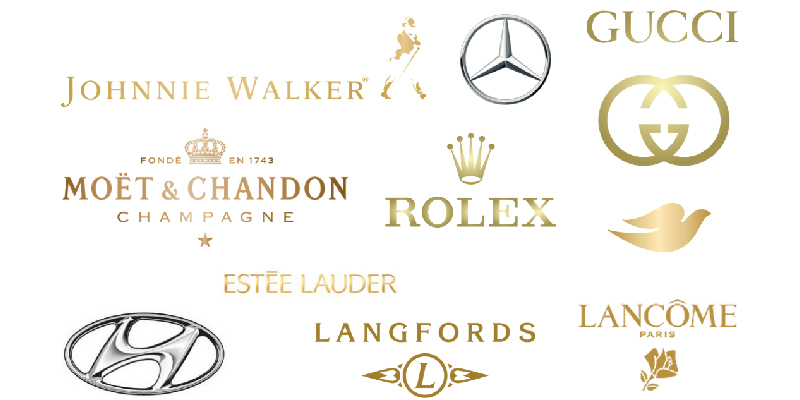
Gold
Gold is associated with luxury, success, and prosperity. Brands like Rolex, Hilton, and American Express use gold to communicate exclusivity, opulence, and high-quality craftsmanship.
Successful Colour Usage in Branding
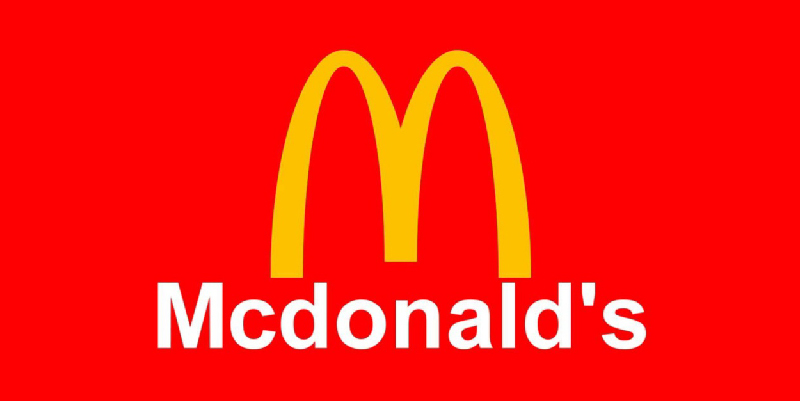
McDonald's
The golden arches of McDonald's are instantly recognisable, and the choice of red and yellow is strategic. Red stimulates appetite and urgency, while yellow conveys joy and friendliness. Together, these colours create a vibrant and inviting atmosphere, enticing customers to indulge in their fast-food offerings.
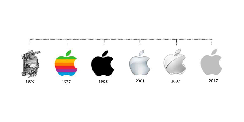
Apple
Apple's iconic logo, a simple bitten apple, is monochromatic and sleek. The use of silver-grey signifies elegance, innovation, and modernity. The minimalist approach aligns with Apple's brand identity and resonates with their design-centric audience.
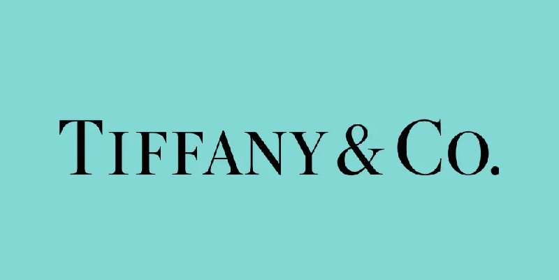
Tiffany & Co.
Tiffany & Co. is synonymous with luxury and sophistication. Their signature robin's egg blue colour, known as Tiffany Blue, evokes feelings of exclusivity and elegance. The use of this unique shade across their branding instantly evokes a sense of luxury and high-quality craftsmanship.
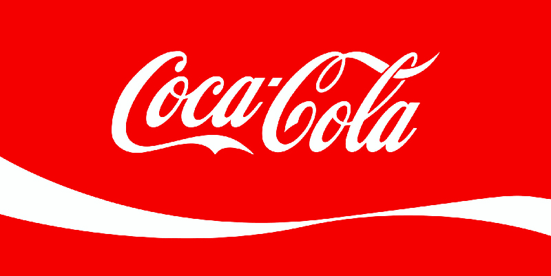
Coca-Cola
Coca-Cola's red and white colour scheme is iconic and instantly recognisable. The vibrant red evokes feelings of energy, excitement, and passion. The use of red in their logo and packaging has played a significant role in building brand recognition and creating a sense of brand loyalty among consumers.

Spotify
Spotify's brand identity revolves around a vibrant shade of green. The green colour evokes feelings of freshness, growth, and creativity. Spotify's use of green aligns with its positioning as a platform for discovering new music and cultivating personalised playlists.
Colour Choices That Missed the Mark
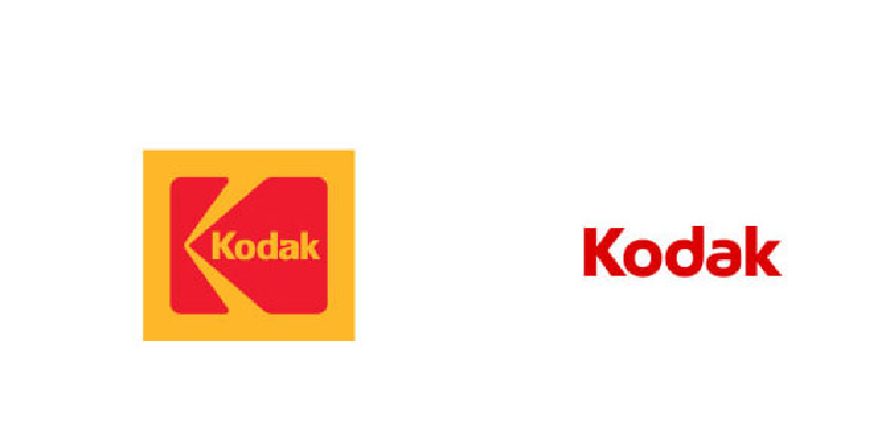
Kodak
Once a dominant player in the photography industry, Kodak underwent a rebranding in the 2000s, shifting from their iconic yellow and red logo to a bland, monochromatic design. This change neglected the brand's strong emotional connection with consumers and failed to communicate the brand's rich history and sense of nostalgia.

JCPenney
In 2011, JCPenney made a drastic shift in their branding strategy, opting for a bold red logo with the tagline "Fair and Square." However, this departure from their classic blue and white branding confused and alienated their existing customer base. The choice of red, associated with discounts and clearance sales, failed to capture the desired upscale positioning.
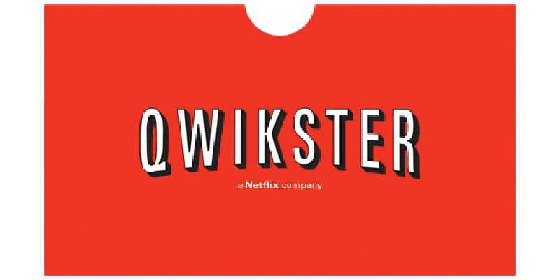
Netflix (Qwikster Rebranding)
In 2011, Netflix made a significant branding misstep by attempting to separate its DVD rental service under a new brand called Qwikster. The decision included a new logo with a combination of red and purple hues. This colour choice lacked the association with entertainment and streaming services that Netflix had built over the years. The rebranding attempt was met with confusion and backlash from customers, prompting Netflix to abandon the Qwikster brand and revert to its original branding.
Colour is a powerful tool in branding, capable of eliciting emotions, creating associations, and influencing consumer perceptions. By understanding the psychology of colour and its impact on human behavior, brands can strategically leverage colour to strengthen their brand identity, connect with their target audience, and communicate their desired message effectively. Successful brands carefully choose colours that align with their values, differentiate them from competitors, and create a memorable brand experience.
However, it's important to note that colour meanings can be subjective and culturally influenced, so brands should conduct research and consider their specific target market when selecting colours for their brand. By harnessing the power of colour in branding, businesses can create a visual language that resonates with consumers, drives brand recognition, and fosters long-term brand loyalty.
Thanks for reading
related posts


about the author

about the author
Viv Harries is the Founder of Vivi Creative. He works with businesses to give them the creative edge with unique designs and a solid brand identity.