

Viv Harries is the Founder of Vivi Creative. He works with businesses to give them the creative edge with unique designs and a solid brand identity.
recent posts
- What's the Difference Between a Logo and a Brand Identity?
- How Much Does Brand Design Cost in the UK?
- What Is Branding? A Guide for Business Owners in 2026
- Thinking About Rebranding Your Business in Wales? Here’s What You Need to Know
- How to Build a Brand That Connects Emotionally with Your Audience
Hidden meanings behind famous logos
You see awesome designs everyday, everywhere you go. Have you ever stopped to think about the real meaning behind some of the world's most famous brands?
To design an awesome logo is not as easy and straightforward as people think. You need to be creative and imaginative to produce a truly memorable brand.
Even the simplest logo can take a great deal of time to develop and hours of brainstorming to come up with that unique idea.
Some of the most memorable and iconic logos as well as being beautifully designed, actually have very clever hidden meanings.
In this blog post we are going to look at 10 iconic logos and the hidden messages and meanings behind them.
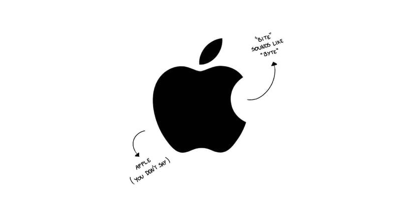
1. Apple (Brand mark)
The most iconic of all logos currently on the market. The pure simplicity of Apple's iconic logo is awesome, there is no need to ever write the name of the company. I love the play on the word bite and computer byte.
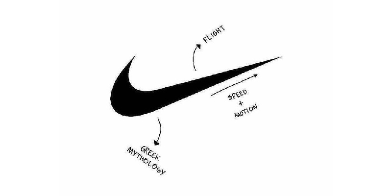
2. Nike (Brand Mark)
Is an another iconic logo, known across the world simply from the swoosh. Over time the Nike icon has also been simplified to just the symbol. The logo actually owes its origin to greek mythology, Nike is the Winged Goddess of Victory. The swoosh is based on her wing, which symbolises the sound of speed, movement, power and motivation.
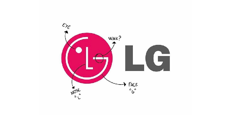
3. LG (Word Mark Logo)
LG has used their initials to create a smiling happy face winking at you. Their tagline ‘Life’s good’ always makes me smile when I turn on my TV.
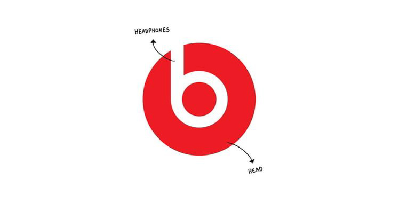
4. Beats by Dre (Letter Mark)
Such a simple idea so well implemented by Beats. The circle is the head and the first letter of the brand is formed to create the headphones. Dr Dre and his headphones were such a successful brand that they were recently bought by Apple for $3 Billion.
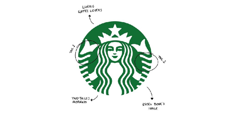
5. Starbucks (Emblem Mark)
Here is another company that owes its logos origins in Greek Mythology. The Starbucks logo is based on the image of the Siren or Twin Tailed Mermaid that enchanted sailors and lured them to shipwreck off an island.
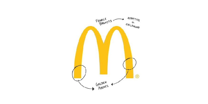
6. McDonalds (Letterform Mark)
No logo discussion would be complete without looking at the famous yellow arches. This logo has a few different messages. As well as being the initial letter of the company's name and symbolising the arches built on the original McDonald's drive through in 1952. It also represents boobs! well actually, mothers breasts nurturing a childhood appetite. That's one you can tell you mates when you're next having a Big Mac.
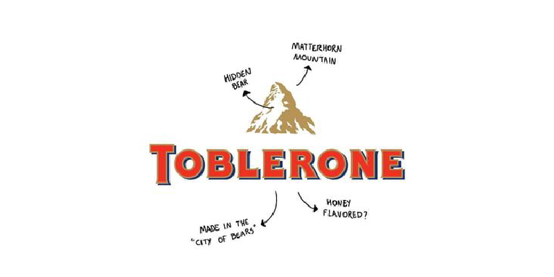
7. Toblerone (Pictorial Mark)
The Toblerone logo has a hidden bear in the mountain that is a nod to Bern (city of bears), and the mountain is the Matterhorn in Switzerland, where the original chocolate was made.
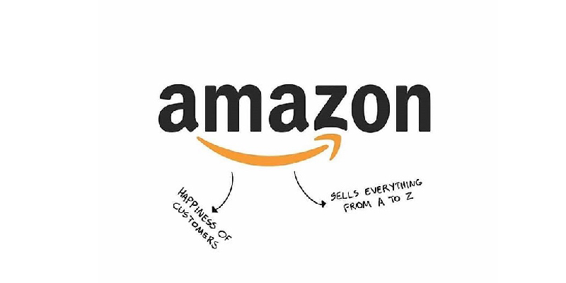
8. Amazon (Word Mark)
One of the biggest and most well known companies in the world. It is a logo that we probably see every day. The smile under the name is there to emulate positivity and customer satisfaction. It also points out that Amazon sells everything from A through to Z.
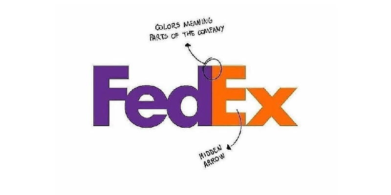
9. FedEX (Word Mark)
The Fedex logo is an awesome example of how to use white space or empty space. It was designed in 1974 by Lindon Leader. The logo has won over 40 awards internationally thanks to its simplicity. The arrow is created to make people sublimely think of movement and forward motion.
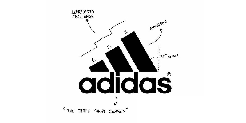
10.Adidas (Abstract Marks)
The three stripes in the Adidas logo come from their 3 striped shoe design, but also forms the shape of a mountain, which represents the challenges athletes face.
How many of the hidden messages did you know?
related posts

about the author

about the author
Viv Harries is the Founder of Vivi Creative. He works with businesses to give them the creative edge with unique designs and a solid brand identity.