

Viv Harries is the Founder of Vivi Creative. He works with businesses to give them the creative edge with unique designs and a solid brand identity.
recent posts
- What's the Difference Between a Logo and a Brand Identity?
- How Much Does Brand Design Cost in the UK?
- What Is Branding? A Guide for Business Owners in 2026
- Thinking About Rebranding Your Business in Wales? Here’s What You Need to Know
- How to Build a Brand That Connects Emotionally with Your Audience
Nokia's Recent Rebrand
In February 2023, Nokia, the renowned Finnish telecommunications company, embarked on a transformative journey, not just in the realm of technology but in the very essence of its brand identity. The company, known for its historic contributions to the mobile phone industry, made headlines with its bold decision to undergo a comprehensive rebranding initiative.
Why Rebrand?
Nokia's decision to rebrand stems from a multifaceted strategic vision aimed at realigning its brand identity with the evolving landscape of technology and consumer expectations. Nokia recognised the need to adapt and innovate in an increasingly competitive market characterised by rapid technological advancements and shifting consumer preferences.
One of the primary motivations behind the rebrand was to shed the perception of Nokia as solely a manufacturer of mobile devices and to position the company as a comprehensive technology solutions provider. By broadening its brand identity, Nokia sought to leverage its expertise in telecommunications, networking solutions, and digital infrastructure to better resonate with diverse customer segments and capitalise on emerging opportunities in sectors such as 5G, IoT, and cloud services.
Furthermore, Nokia's rebranding initiative aimed to communicate a revitalised sense of purpose and relevance to stakeholders, signaling its commitment to driving innovation, sustainability, and societal impact in an increasingly interconnected world.
What did the public think?
The unveiling of Nokia's rebrand sparked considerable intrigue and speculation among industry analysts, consumers, and stakeholders alike. Anticipation ran high as the company teased glimpses of its new visual identity and messaging, fueling speculation about the direction of its brand evolution.
Upon the official reveal, public opinion regarding Nokia's rebranding was largely positive, albeit with a degree of cautious optimism. Many applauded the company's boldness in embracing change and applauded its efforts to modernise its brand image while staying true to its heritage of innovation and quality.
The streamlined logo, contemporary visual elements, and refreshed brand messaging resonated with audiences, signaling a forward-thinking approach aligned with the demands of the digital age.
However, as with any significant rebranding endeavor, there were also voices of dissent and skepticism. Some loyalists expressed nostalgia for Nokia's iconic past, lamenting the departure from familiar brand elements. Additionally, there were concerns about the potential risks associated with repositioning a well-established brand in a competitive market landscape.
From a strategic standpoint, Nokia's rebranding represents a pivotal moment in its ongoing evolution as a technology powerhouse. By redefining its brand identity and positioning, Nokia is better equipped to navigate the complexities of an ever-evolving industry landscape, differentiate itself from competitors, and forge deeper connections with customers and partners.
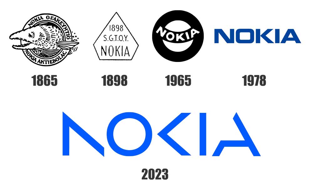
With roots stretching back to the 1960s, Nokia had long been recognised for its durable mobile phones. However, recognising the need to shed outdated perceptions and reaffirm its position as a pioneering force in tech innovation, Nokia turned to Lippincott to spearhead its rebranding efforts. The goal was clear: to convey Nokia's evolution from a mobile phone manufacturer to a forward-thinking leader in B2B technology solutions.
Honoring Heritage
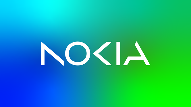
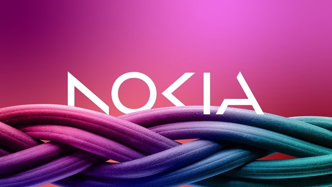
Lippincott's approach to Nokia's rebranding struck a delicate balance between honoring the company's rich history and embracing a forward-looking aesthetic. Retaining the distinctive sharpness of the 'K' from Nokia's original logo, the redesign introduced lighter, more dynamic forms, shedding the heavy industrial feel of the past while imbuing the logo with a contemporary allure.
A hallmark of Lippincott's redesign was its emphasis on collaboration and connectivity. Leveraging an optical play known as apophenia, each letter in the logo was transformed into simplified digital forms, inviting the viewer to intuitively complete the invisible connections. This subtle yet powerful symbolism underscored Nokia's belief in the power of collaboration and its commitment to forging meaningful connections in an increasingly interconnected world.
In a departure from the conventional approach of the tech industry, Nokia's revised logo embraced versatility and dynamism. Set against a vibrant kaleidoscope palette of colours, the predominantly white logo exuded a sense of modernity and adaptability, perfectly suited for the digital age. Its streamlined design and optimised motion capabilities ensured seamless integration across various digital platforms, further reinforcing Nokia's commitment to innovation and technological advancement.

Melissa Schoeb, Nokia's chief corporate affairs officer, articulated the significance of the rebrand, stating,
"This is a bold step in Nokia’s journey – and will help us get recognised by existing and prospective customers for the B2B technology innovation leader we are today."
She emphasised that the brand refresh marked a transformative moment in Nokia's history, signaling the company's readiness to embrace the future with confidence and purpose.
Nokia's redesigned logo stands not only as a visual symbol of its evolution but also as a testament to its unwavering commitment to innovation, collaboration, and progress. By embracing change with courage and conviction, Nokia reaffirms its position as a trailblazer in the ever-evolving landscape of technology, poised to shape the future of B2B tech innovation for years to come.
Thanks for reading.
related posts

about the author

about the author
Viv Harries is the Founder of Vivi Creative. He works with businesses to give them the creative edge with unique designs and a solid brand identity.