Viv Harries is the Founder of Vivi Creative. He works with businesses to give them the creative edge with unique designs and a solid brand identity.
recent posts
- What's the Difference Between a Logo and a Brand Identity?
- How Much Does Brand Design Cost in the UK?
- What Is Branding? A Guide for Business Owners in 2025
- Thinking About Rebranding Your Business in Wales? Here’s What You Need to Know
- How to Build a Brand That Connects Emotionally with Your Audience
How to choose the right font for your brand
When you think about branding, one of the most important and often overlooked parts is the chosen type face. The art of typography is like a silent conductor, that orchestrates the symphony of your brand's identity.
Typography isn't just about letters; it's about capturing emotions, establishing credibility, and forging an indelible connection with your audience.
In this blog post, VIVI Creative delves into the intricate world of typography, we will showcase some prime examples of effective font choices and try to unravel the methodology behind font selection.
Typography in Branding
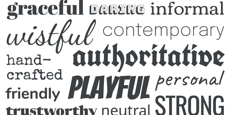
Typography is the heartbeat of your brand's visual language. It's the vintage script that whispers elegance, the bold sans-serifthat screams modernity, and the playful display font that ignites curiosity.
Examples of Masterful Typography
Apple
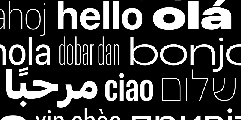
The Cupertino giant has masterfully harnessed the power of typography through the San Francisco font. Its clean, contemporary lines harmonise with Apple's minimalist design ethos, creating an interface that's both visually pleasing and user-friendly.
Dior
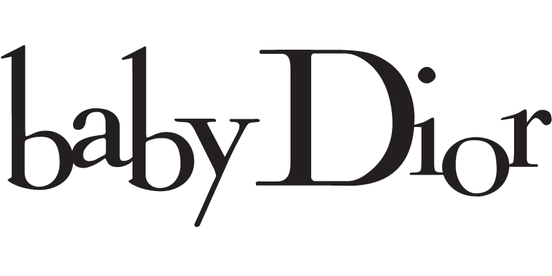
The haute couture house employs the elegant Didot typeface to mirror its sense of luxury, sophistication, and classic style. The font's slender serifs and graceful curves seamlessly echo Dior's timeless elegance.
Crafting Your Brand's Typography
1. Define Your Brand Persona:
Begin by deciphering your brand's personality, values, and target audience. Is your brand youthful or sophisticated? Innovative or traditional?
2. Select the Right Typeface:
Choose a primary typeface that encapsulates your brand's essence. Whether it's a bold serif or a sleek sans-serif, ensure it resonates with your core identity.
3. Establish Hierarchy:
Craft a typographic hierarchy that guides your audience's gaze. Headlines, subheadings, and body text should be distinguished by size, weight, or style.
4. Pairing is Key:
If you're opting for multiple fonts, make sure they complement one another. A classic pairing is a sans-serif headline with a serif body text.
5. Test for Legibility:
Your typography should be legible across various platforms and screen sizes. Test your chosen fonts rigorously to ensure seamless readability.
Brands that Epitomise Typographic Brilliance
Netflix
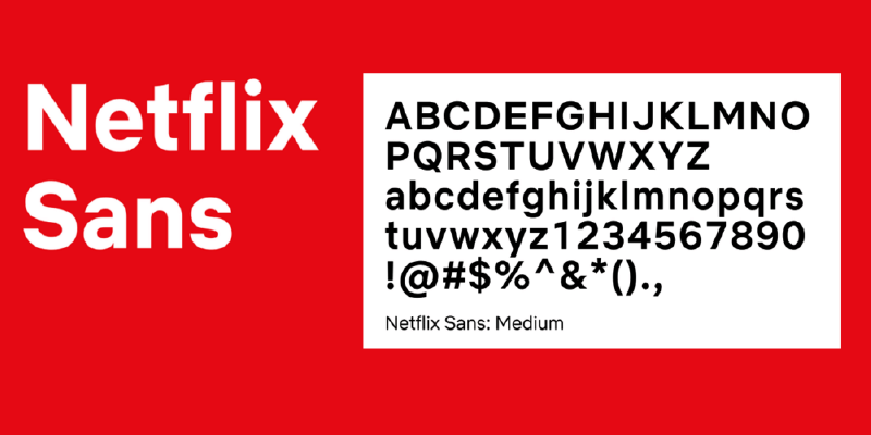
The streaming giant employs "Netflix Sans" as its custom typeface. Its modern yet unobtrusive nature underpins Netflix's commitment to seamless, user-friendly entertainment.
IKEA
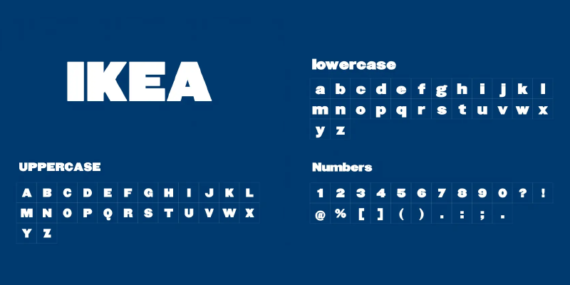
The IKEA font, affectionately called "IKEA Sans," radiates simplicity and functionality. Its no-nonsense design aligns with IKEA's ethos of practicality and affordability.
Adobe
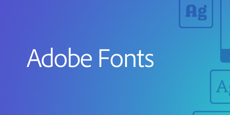
Adobe's clean, geometric logo font speaks volumes about its commitment to innovation, precision, and creative expression.
Choosing the right font for your brand
This is a nuanced process that involves aligning visual aesthetics with your brand's personality, values, and target audience. Here's a step-by-step guide to help you navigate the art of font selection:
1. Define Your Brand Identity
Before delving into typography, have a clear understanding of your brand's identity. Consider your brand's core values, mission, personality traits, and the emotions you want to evoke. Are you modern or traditional? Playful or professional? These insights will serve as the foundation for your font choice.
2. Know Your Audience
Your target audience plays a significant role in font selection. Consider factors like age, demographics, interests, and cultural preferences. Fonts that resonate with your audience can create a stronger connection and enhance engagement.
3. Understand Font Categories
Familiarise yourself with different font categories and their connotations:
Serif Fonts: Classic, traditional, and often associated with elegance and authority.
Sans-Serif Fonts: Modern, clean, and versatile, conveying simplicity and clarity.
Script Fonts: Elegant, handwritten, and often associated with creativity and personalisation.
Display Fonts: Bold, unique, and attention-grabbing, suitable for logos and headlines.
4. Reflect Your Brand Personality
Choose a font that resonates with your brand's personality. For instance:
If you're a luxury brand, consider elegant serif fonts.
For a tech company, opt for modern sans-serif fonts.
Playful brands can experiment with creative display or script fonts.
5. Ensure Readability
While aesthetics are crucial, never compromise on readability. The chosen font must be legible in various sizes and across different devices. Avoid overly decorative or intricate fonts that might hinder readability.
6. Typography Hierarchy
Establish a clear hierarchy for your typography, differentiating between headlines, subheadings, and body text. This helps guide readers' attention and ensures a harmonious visual flow.
7. Pairing Fonts Skillfully
If using multiple fonts, make sure they complement each other. Pair a bold headline font with a more subtle body text font for contrast. Choose fonts that share similar characteristics or create a deliberate contrast for visual interest.
8. Custom Fonts vs. Web-Safe Fonts
Decide whether to use custom fonts or web-safe fonts. Custom fonts can enhance uniqueness but might require web font embedding. Web-safe fonts ensure consistency across different devices but might limit creativity.
9. Test and Iterate
Don't rush the decision. Test your chosen fonts in different contexts, such as your website, social media, and marketing materials. Gather feedback from peers, stakeholders, or even potential customers to fine-tune your selection.
10. Stay Consistent
Once you've chosen your fonts, maintain consistency across all brand touchpoints. Consistent typography reinforces brand recognition and strengthens your visual identity.
Successful Examples of Brand Typography
Coca-Cola
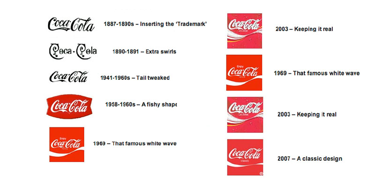
The timeless Spencerian script embodies the brand's warmth and authenticity, making it instantly recognisable.
Nike
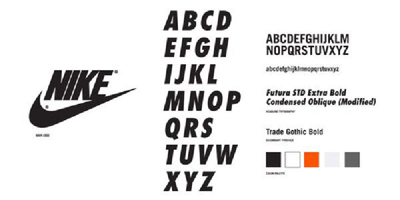
The bold and dynamic "Nike Gothic" font captures movement and energy, aligning with the brand's spirit of athleticism.
In essence, choosing the right font for your brand requires a delicate balance between aesthetics and functionality. By understanding your brand's essence, considering your audience, and meticulously evaluating font options, you can select typography that effectively communicates your brand's message and values.
Creating a custom typeface
Creating a custom typeface, also known as a custom font or a brand font, can be a strategic decision for a brand looking to establish a unique and distinctive visual identity. However, like any creative endeavor, there are both pros and cons to consider before embarking on the journey of designing a custom typeface.
Pros of Creating a Custom Typeface
1. Distinctive Brand Identity
A custom typeface sets your brand apart from the competition. It ensures that your typography is entirely unique, reinforcing your brand's individuality and making it instantly recognisable.
2. Alignment with Brand Values
Custom typefaces can be tailored to embody your brand's specific personality and values. Every letterform, curve, and angle can be designed to convey the desired emotions and characteristics.
3. Consistency
A custom typeface allows you to have complete control over the design, ensuring consistency across all brand touchpoints, from your website to packaging, print materials, and beyond.
4. Typography Hierarchy
Designing a custom typeface allows you to create a hierarchy that perfectly suits your brand's communication needs. You can optimise legibility for headlines, subheadings, and body text, enhancing the overall user experience.
5. Memorability and Recognition
A unique typeface enhances brand memorability and recognition. Customers are more likely to remember your brand when your typography stands out in their minds.
6. Legal Protection
Creating a custom typeface provides potential legal protection against unauthorised usage by competitors. This can help safeguard your brand's visual identity.
Cons of Creating a Custom Typeface
1. Cost and Time
Designing a custom typeface is a time-consuming and intricate process. It requires expertise and may involve hiring a skilled typographer or type designer. The associated costs can be significant.
2. Resource Intensive
Developing a custom typeface demands a substantial amount of resources, including design software, hardware, and skilled personnel. Small businesses with limited budgets may find this challenging.
3. Usability Challenges
Custom typefaces must be designed with great care to ensure readability and usability across various platforms, devices, and sizes. Poorly designed custom fonts can lead to user frustration and hinder accessibility.
4. Technical Implementation
Integrating a custom typeface into various digital and print platforms can be technically complex. Compatibility issues may arise, necessitating support from web developers and graphic designers.
5. Learning Curve
If your brand uses a custom typeface, employees, partners, and collaborators will need to familiarise themselves with the font's characteristics. This can lead to a learning curve and potential resistance to change.
6. Risk of Over-Designing
Over-complicating the design of a custom typeface can lead to a font that is too stylised, hindering its readability and versatility.
Creating a custom typeface offers numerous benefits, including a unique brand identity and tailored communication. However, it also comes with challenges related to cost, time, usability, and technical implementation. Before deciding to create a custom typeface, carefully evaluate your brand's resources, goals, and the potential impact on your overall branding strategy. If executed thoughtfully, a custom typeface can become a powerful tool that enhances your brand's visual identity and sets you apart in a crowded marketplace.
Here are some examples of custom typefaces;
IBM Plex
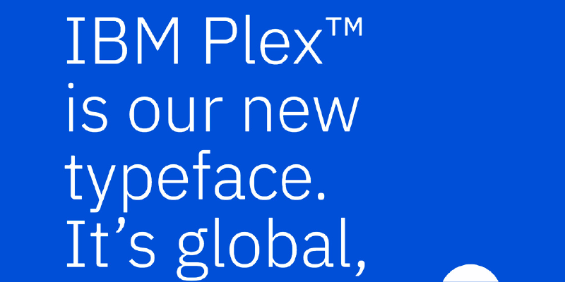
Designer: Mike Abbink, Bold Monday, and IBM Brand & Experience team.
IBM Plex is a versatile typeface family designed to reflect IBM's brand values of clarity, efficiency, and innovation. It includes a range of styles optimised for various applications.
Airbnb Cereal
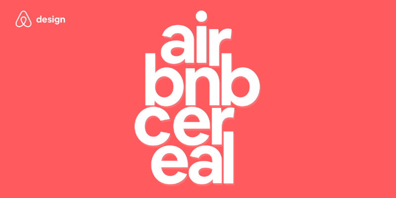
Designer: Dalton Maag
Airbnb's custom typeface, Cereal, was designed to be approachable, elegant, and globally inclusive. It emphasises clarity and legibility across different languages and devices.
Facebook Letter Faces
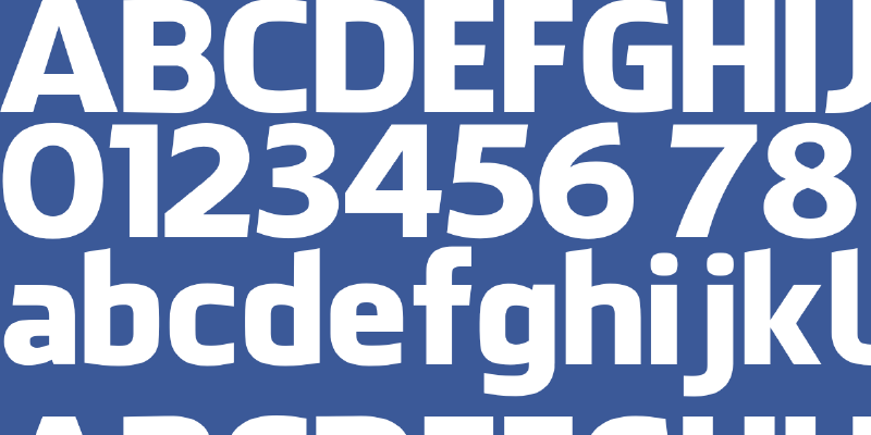
Designer: Joe Kral and the Facebook Design team.
Facebook's Letter Faces typefaces were designed to create a cohesive visual identity for the company. They are inspired by movement, connectivity, and communication.
T-Mobile Magenta

Designer: Erik Spiekermann and Christian Schwartz
T-Mobile's custom typeface, Magenta, was designed to complement the brand's vibrant identity. It's a distinctive and bold typeface that embodies T-Mobile's energetic and forward-thinking approach.
These examples showcase how custom typefaces can be tailored to reflect a brand's values, identity, and design philosophy, creating a unique visual language that sets them apart in the market.
The significance of selecting an appropriate typeface cannot be overstated. It is akin to choosing the right tone of voice or attire for a crucial business presentation—it communicates your brand's essence, values, and aspirations to the discerning eyes of your audience.
Typography is more than an aesthetic choice; it is a strategic decision that requires astute understanding and meticulous execution.
Just as a maestro skillfully orchestrates a symphony, a brand custodian harmonises the visual elements that compose a brand's identity. The typeface takes center stage, dictating the rhythm of the narrative you wish to convey. Whether it is the sharp lines of a sans-serif evoking modernity or the refined serifs resonating with heritage, each typeface has its own lexicon, and as brand stewards, we are the wordsmiths that deftly string them together.
The chosen typeface is your brand's emissary—it beckons the curious, guides the inquisitive, and leaves an indelible imprint on memory. The nuances of ascenders, descenders, and ligatures all play a role in crafting an experience that is not only visually pleasing but also seamlessly legible across mediums and contexts.
With the right typeface, you carve a distinct path through the digital landscape, etching your brand's identity into the hearts and minds of your audience.
Thanks for reading
